PBS
PBS.org
BACKGROUNDPBS.org serves as the hub for PBS: shows and videos, the latest from your local station, content across verticals, and a jumping-off point for other sites in the PBS ecosystem. We revamped the site to address known user pain points for wayfinding, reflect the newly refreshed brand, and boost local station visibility.
OUTCOMESThe new experience tested positively with users and improved discovery by reducing friction to find new shows and jump into episodes. Creating dedicated spaces for Passport, a subscription to unlock archival content, boosted the value of local stations to help convert users to donating members. After the initial MLP launch, we saw a 5% increase in average session duration and 9% increase in users who had completed Passport donation and activation.
The site was well received internally, becoming a rallying point for strengthening station visibility and helping set the course for streamlining experiences across web, mobile apps, and TV.
ROLEPart of the core team that redesigned the site across desktop and mobile.
UX Design, Visual Design, User Testing
CREDITSChris Bishop, Laura King, Chris Koth, Kathleen Kenney
Goals-
Quicker wayfinding to discover shows and jump into video content
-
Boost visibility of your local PBS station
-
Drive Passport activations (paid subscription to unlock exclusive content)
-
Reflect the new brand's principles with a content-forward approach
Flows + Highlights
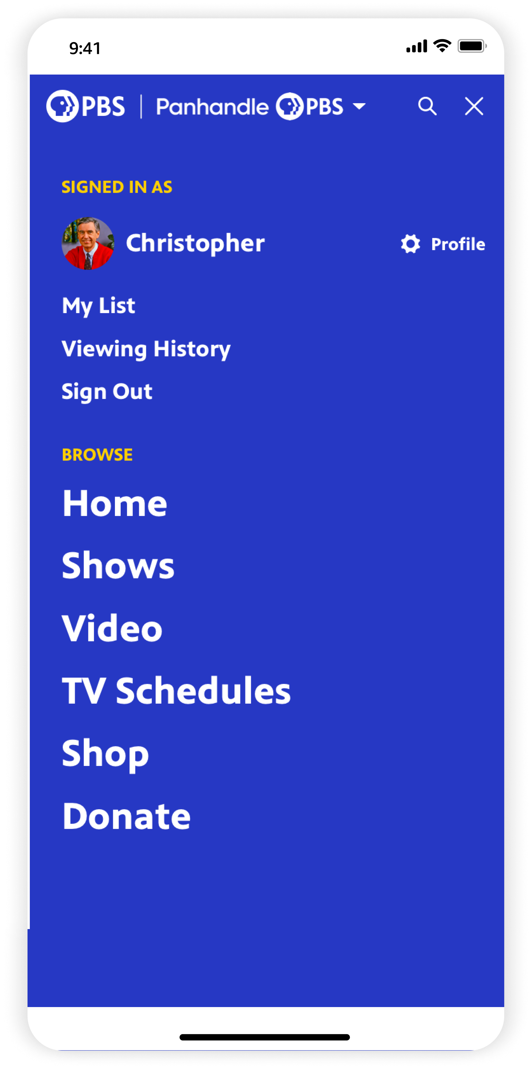
NAVIGATION MEGAMENUSBalancing national and local
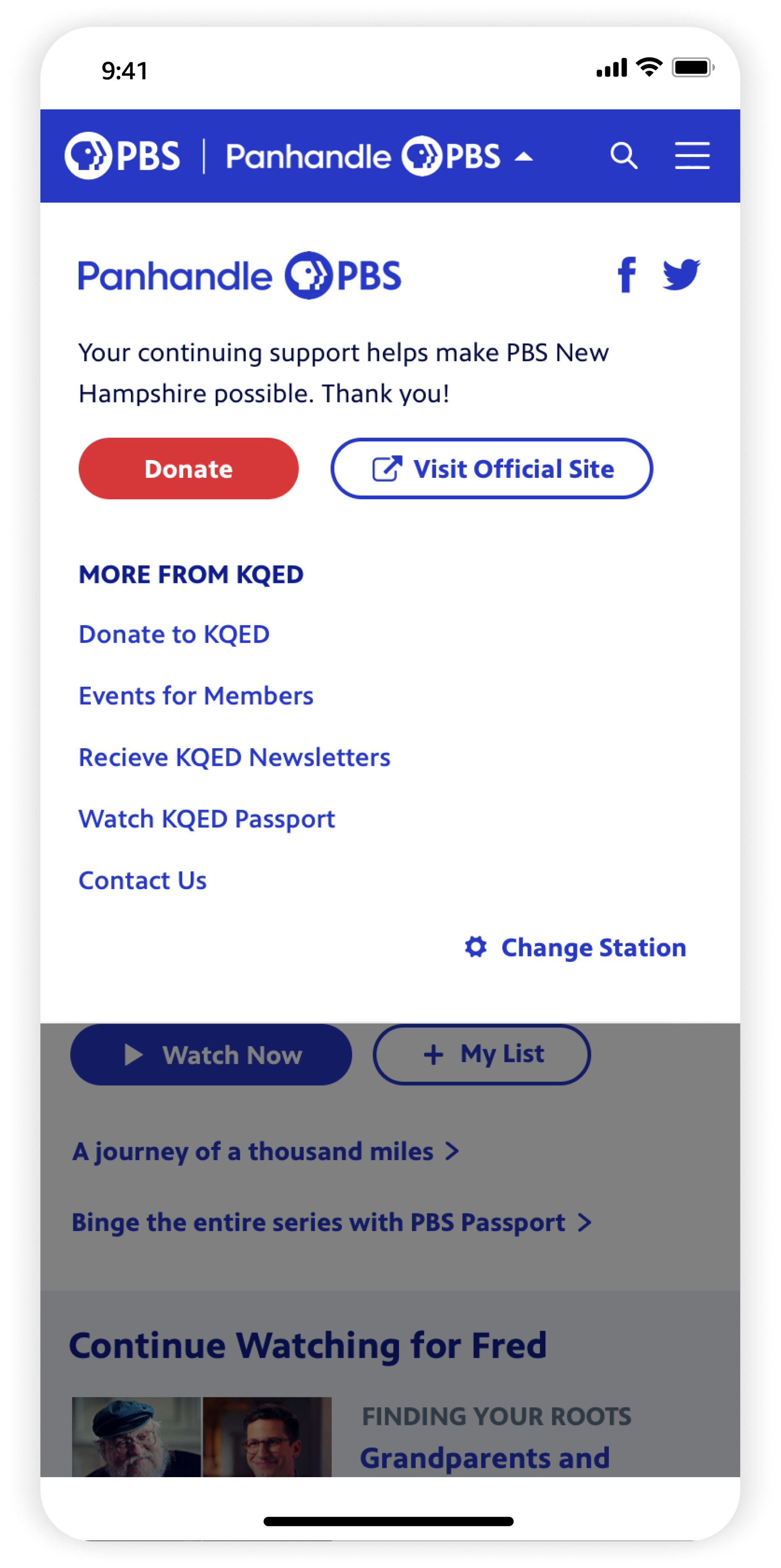
The updated nav housed megamenus balancing national and local content. The station dropdown was moved from its former position (slot 2) to the rightmost side, which prioritized the Profile and avoided branding confusion. Quick links to PBS shops and distribution channels, which accounted for 25% of revenue streams, are highlighted under ‘Shop’ to help drive those conversions.
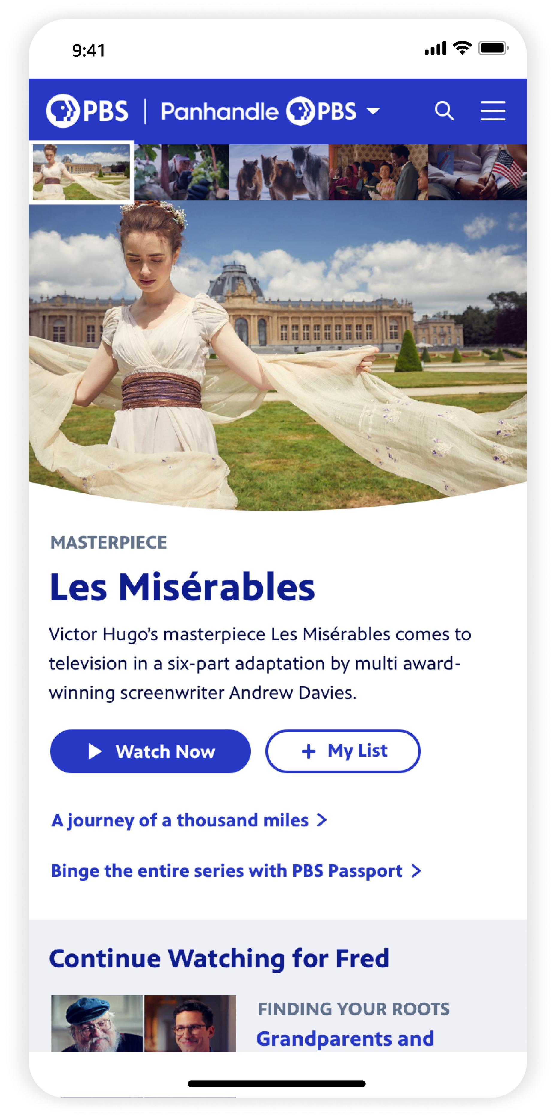
HOMEQuicker pathways to core streaming content
Prominent ‘Continue Watching’ placement, genre discoverability, and video curations on Home improve user pain points: hunters wanted quicker ways to get to their saves, and casual browsers wanted easier ways to discover new shows. At the same time, we balanced this with business goals to: 1) boost local station visibility; 2) feature latest verticals content; and 3) highlight Passport and PBS shop channels.

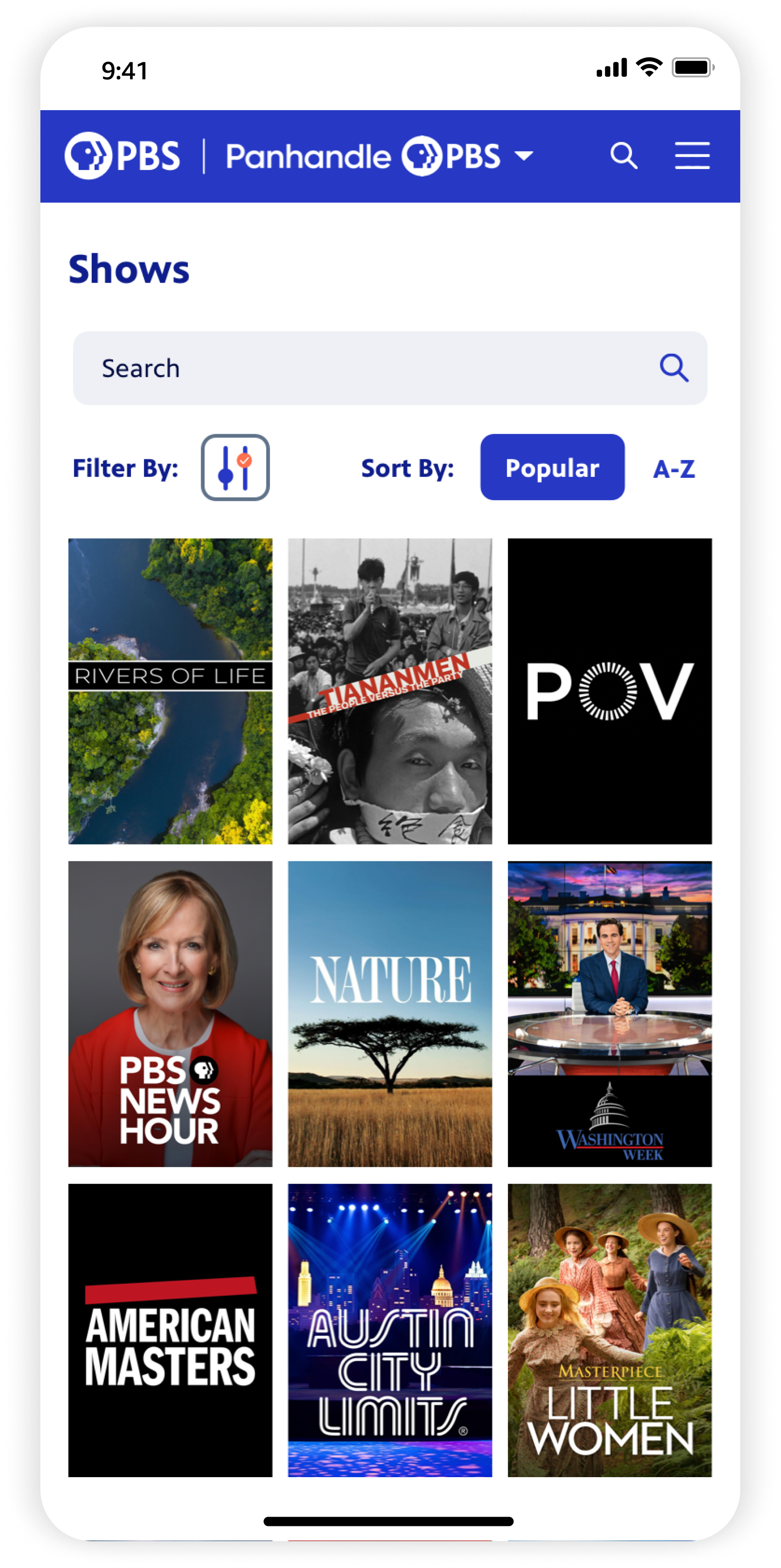
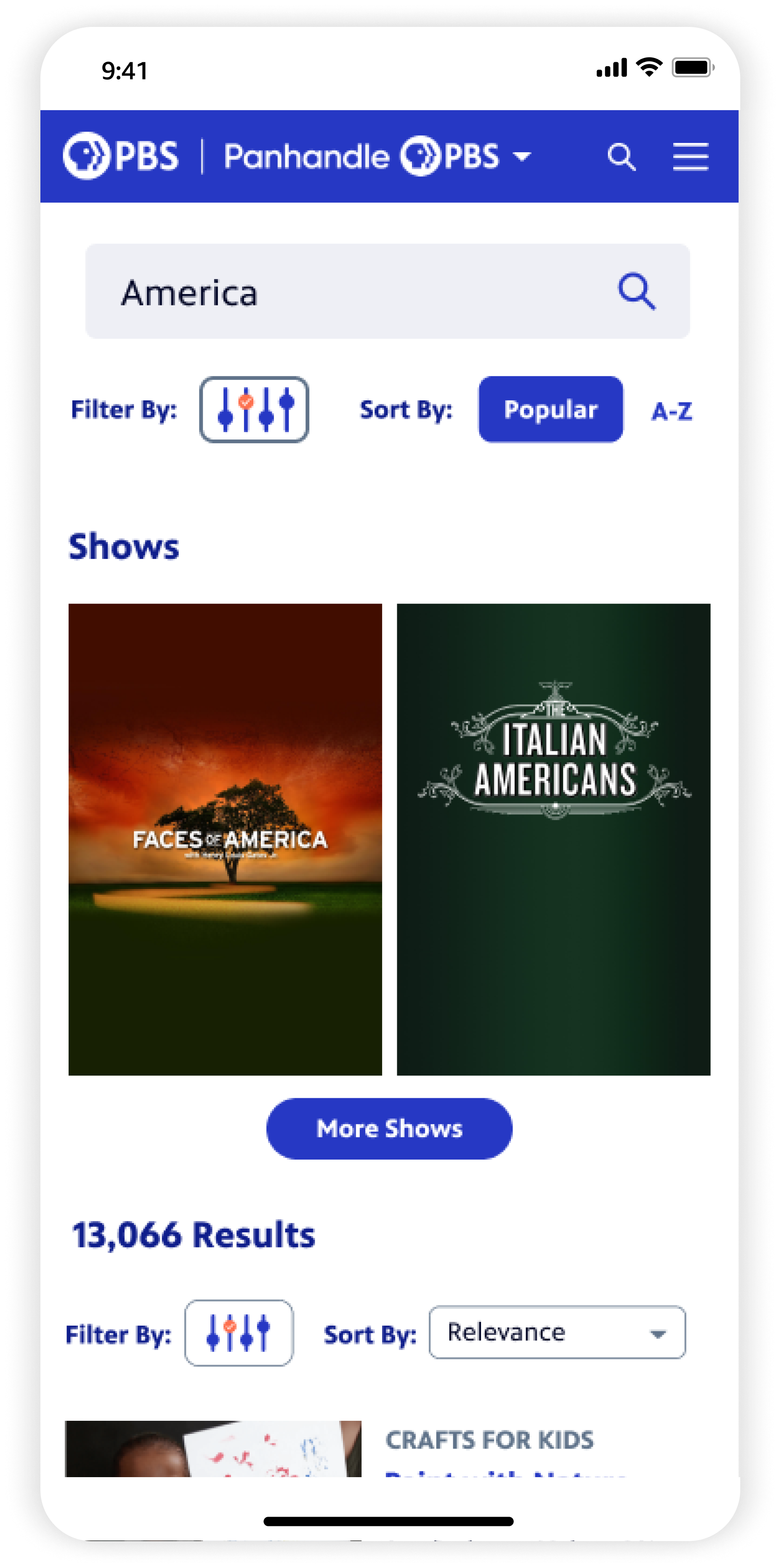
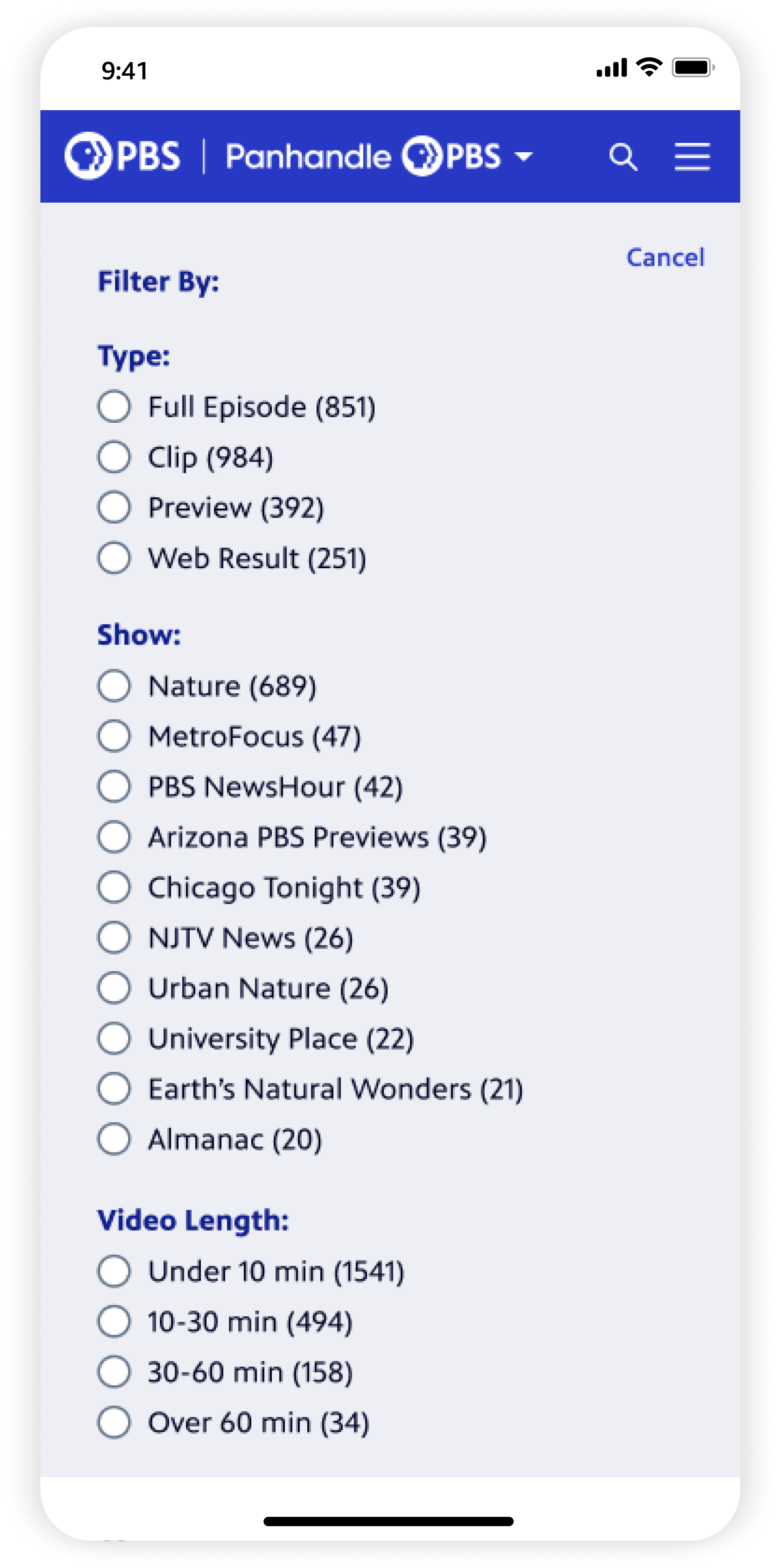
SHOWS + SEARCH RESULTSStreamlining and making refinement easier
Moving filters to a left panel enabled component consistency across these pages. On Shows, users can filter by genre, Passport, or local station, and view quick details/add to List on hover. In Search, users now have all filters/sorting exposed by default. Users can jump into the latest episode for exact matches.
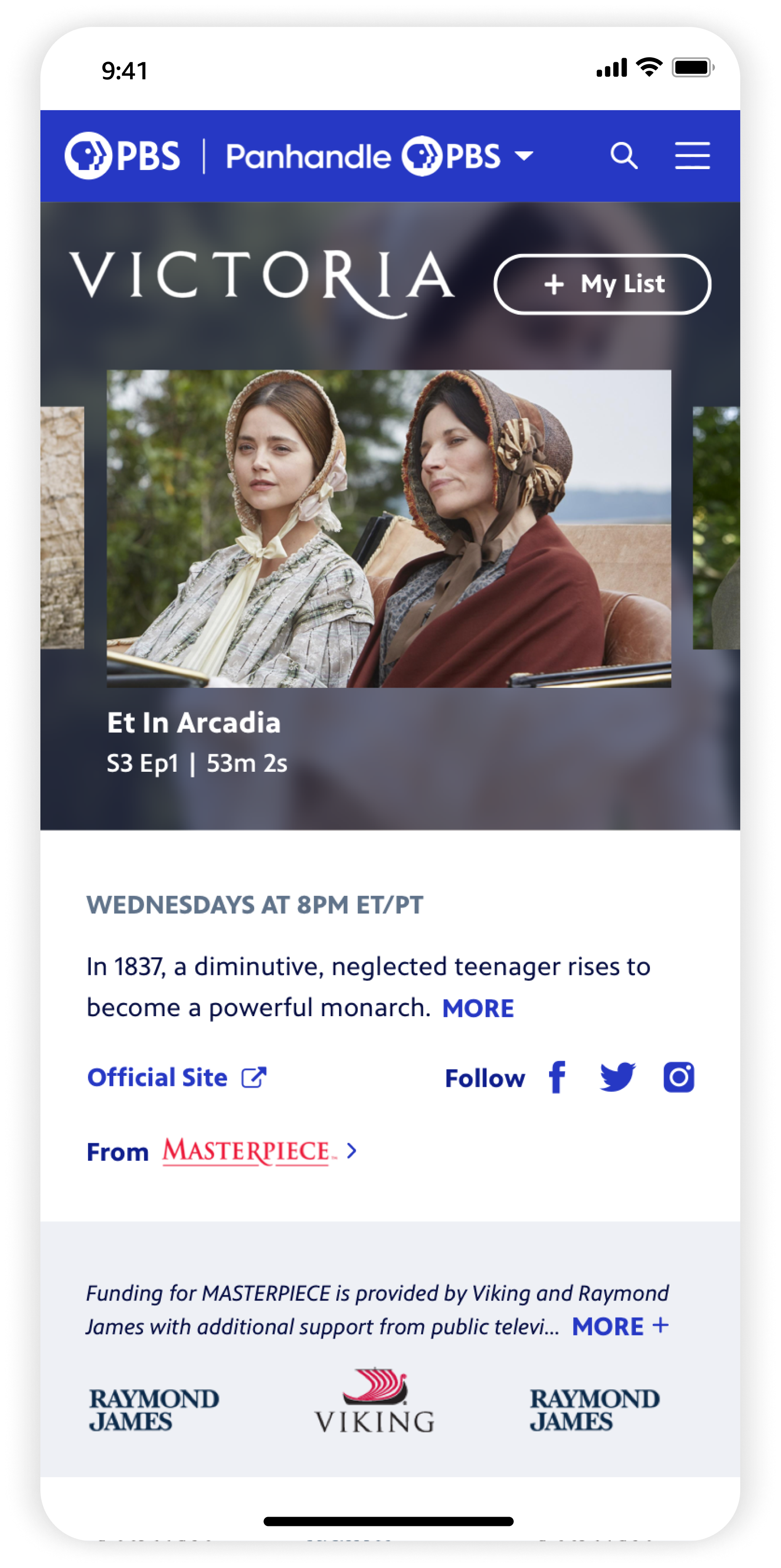
SHOW DETAIL + VIDEO DETAILReducing friction to binge more content
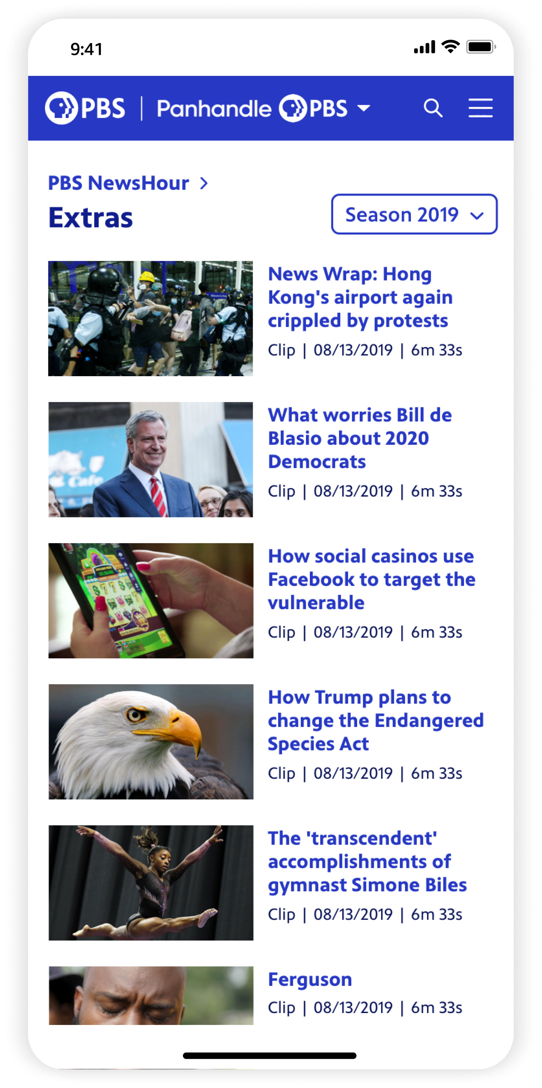
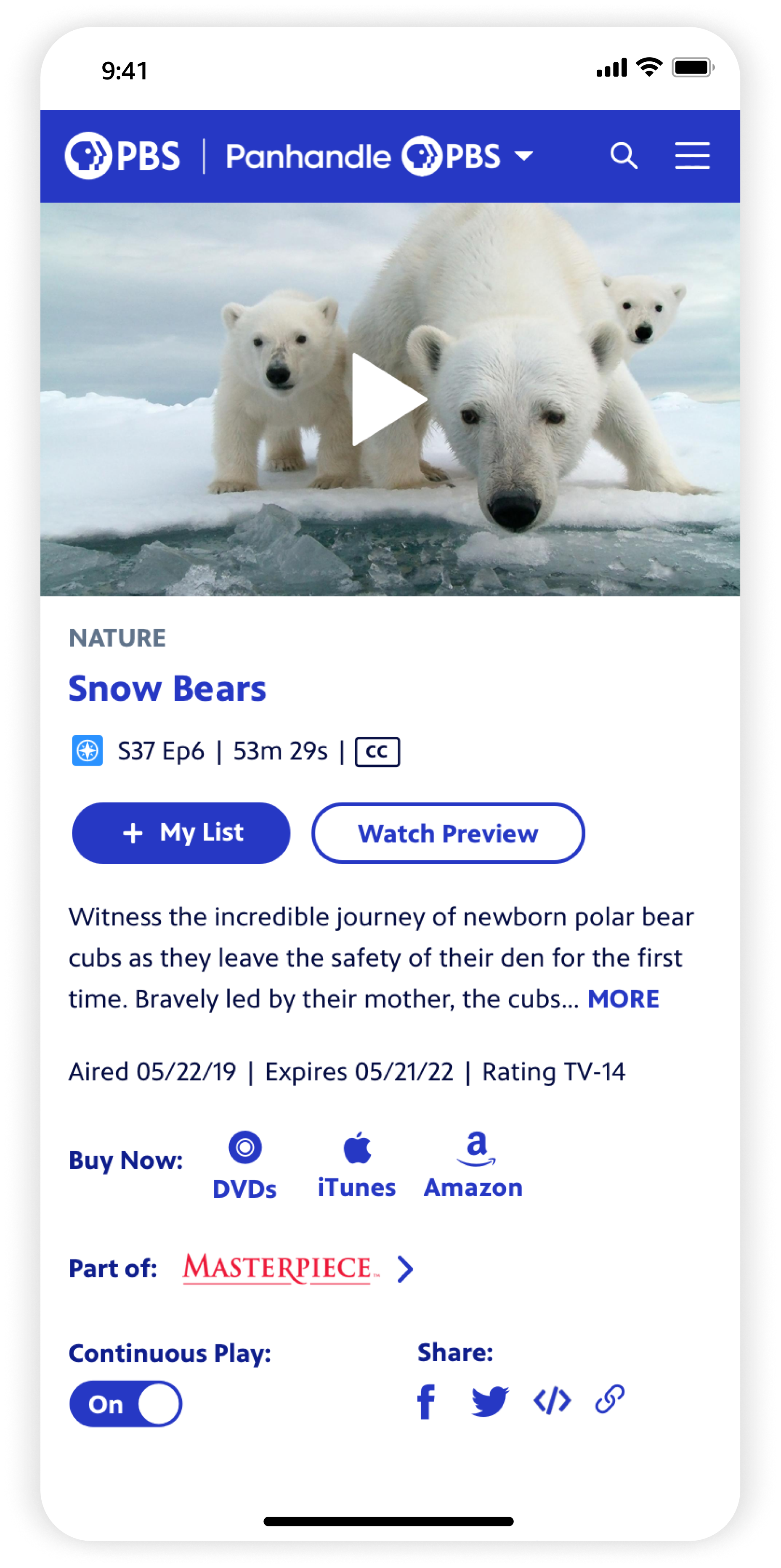
The new Show and Video Detail pages took an immersive, content-first approach. Show focused on jumping into Episodes as quickly as possible. Browsing extras and collections is easier with an ‘all seasons’ view, and web exclusives/similar show recs boost content discoverability. The Video page, with playback and details side-by-side, is much more space efficient than the previous version. Continuous Play controls are exposed instead of buried, and related bonus content is accessible right away.
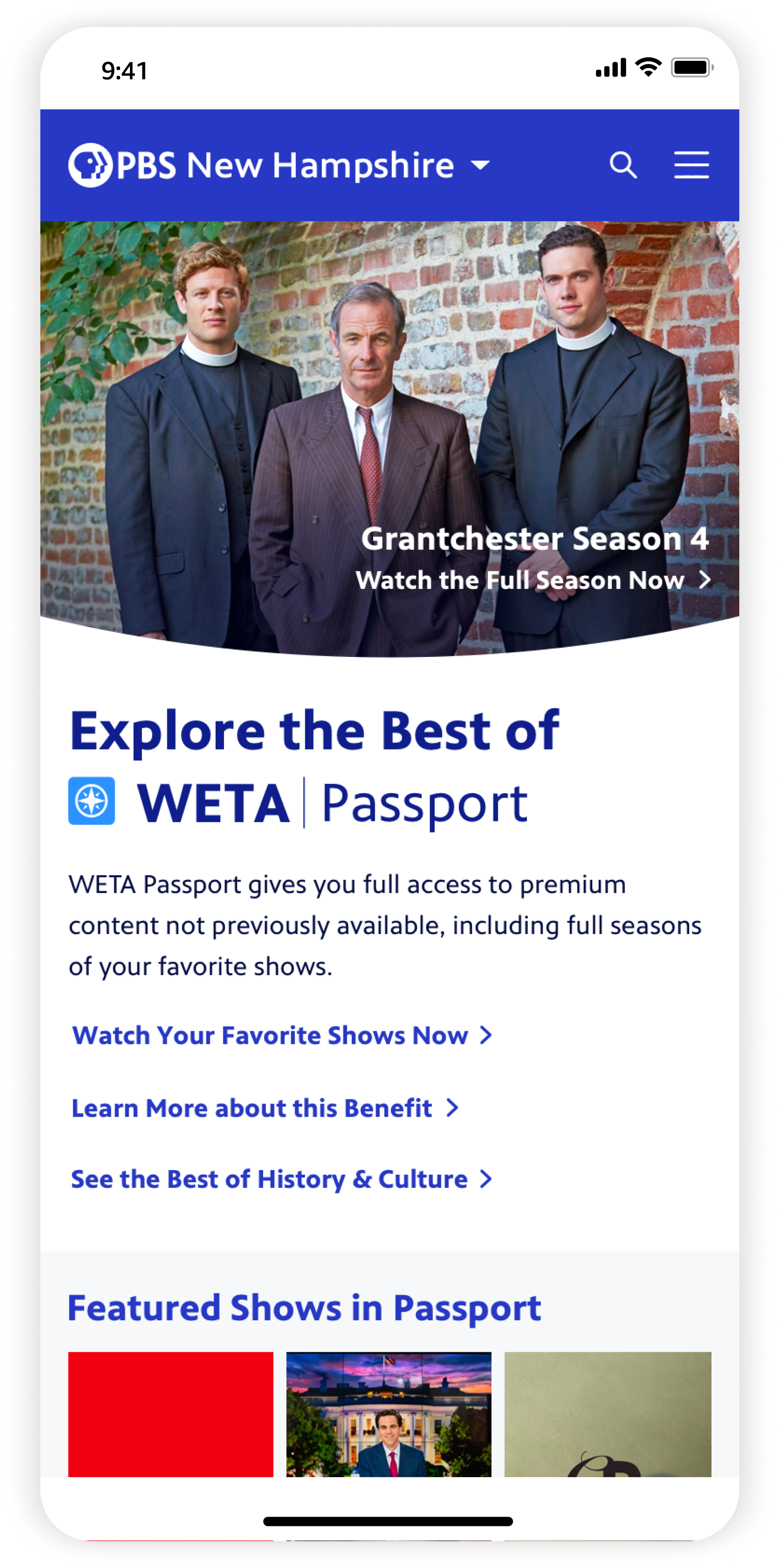
PASSPORT INTEGRATIONStream exclusive content with Passport membership
PBS Passport, a subscription to unlock archival content by becoming a donating member of your local station, now had dedicated spaces. Passport content had its own curated landing page, and was featured on Home, across megamenus, as a filter on Shows Landing and Search — creating freshness, clarity on what’s available in Passport, and showcasing value of becoming a member.
MOBILE-
![]()
Home
-
![]()
Station Dropdown Menu
-
![]()
Shows
-
![]()
Show Detail
-
![]()
Show Extras
-
![]()
Video Detail
-
![]()
Search
-
![]()
Search Filtering
-
![]()
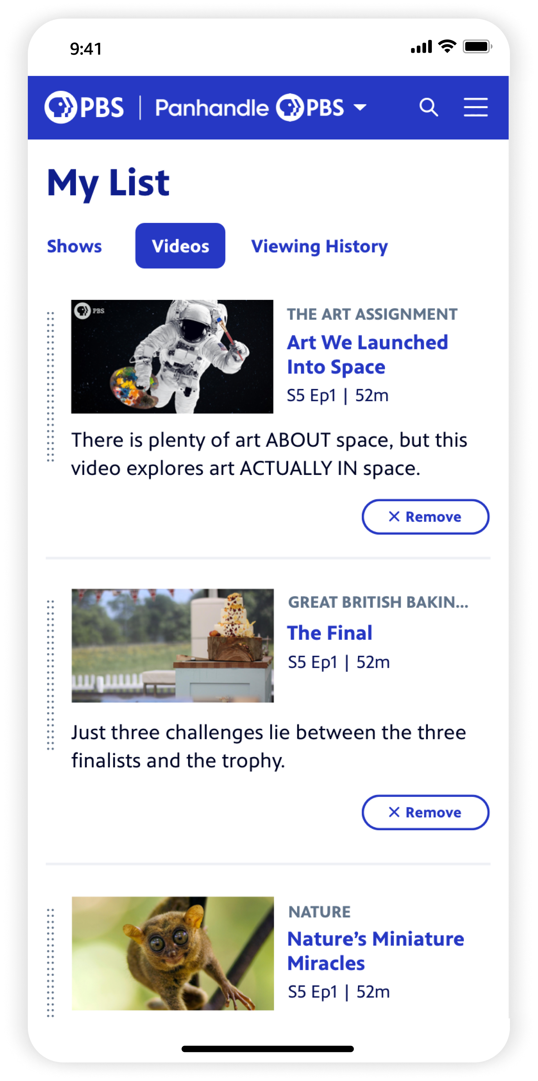
My List
-
![]()
Passport Landing
-
![]()
Menu
-
![]()
Global nav on 2P sites
A peek into the process
BEFOREA snapshot of the previous site

EARLY SKETCHESDiscovery + exploration
Initial exploratory phases were led by a former colleague who left PBS shortly after completing sketches and initial wireframes, seen here. She had performed stakeholder reviews and laid the groundwork for content requirements on key pages.
Early WIREFRAMES
Our former colleague also completed initial wireframes of a few key screens (Home, Shows Landing, Videos Landing, Show Detail) that were focused on MVP updates closer to the previous site’s framework. After her departure, I collaborated closely with our Director of UX and Production Designer to take over the project.
An MVP of key screens

Visual design EXPLORATIONSBringing the new brand to life
The team transition put us on an accelerated timeline. Since I had led the redesign of the PBS Video app for mobile and TV a few months prior, and our team was finalizing the brand’s visual system, at this point we had a clearer vision for PBS.org.
With these learnings in mind, we knew we could push the site even further and rapidly iterated on hi-fidelity visual designs for two important elements: the Navigation and the Homepage Hero. As both were information-dense, these iterations helped strike the right visual balance and hierarchy.
WATERFALL DESIGN PROCESSRapid iterations
We had to move fast under time constraints. As Home was being finalized, we were sketching the other major pages simultaneously to get feedback as quickly as possible.
Below is an example of the Show Detail design process, from sketch to initial visual iterations. The previous version was cluttered with too much information and show branding got lost. We focused the top area into clear sections: key show information and Featured Episodes led the page, while less important info like funder text and sponsors were clearly delineated below.
Below are examples of design iterations on Shows Landing and Video Detail. We needed to solve for users feeling like they had to scroll too far up or down see core video information or enable filters on/off.
KEY CHANGESLearnings from user insights
During our process, we made key directional changes from the early wireframe stage to better achieve the redesign’s original goals. Here are a few notable ones that were directly informed from user insights we gathered along the way.
Making Show and Video pages more efficient — Stripping away previous clutter that made it more difficult to get to content users wanted, we focused above-the-fold to prioritize only the key show/video details, and making jumping into streaming as quick as possible. Users could easily navigate to related bonus content and other shows inline.
Creating dedicated spaces around Passport — We intentionally integrated Passport content throughout the experience. Users were often confused as to what was in Passport and when, with content constantly coming in and out of availability. Updates provided that clarity while keeping Passport feeling fresh, and nudging urgency to become a member to stream exclusive content.
Easier and more useful refinement — Along with streamlining filtering + sorting on Shows Landing and Search pages in a leftside panel, we added new refinement options based on users’ pain points and confusion around content windowing. They could now sort by what’s Expiring Soon, and filter by local station shows and what’s in Passport at this moment.
Impact
After our initial launch of the MLP updates to the site, we saw:
5% increase in average session duration
9% increase in users who had completed Passport donation and activation