PBS
PBS OTT/TV App
BACKGROUNDThe legacy PBS Video OTT apps for tvOS, Fire TV, and Roku sported a clunky, outdated, and severely inconsistent experiences. This project aimed to reimagine the app to improve user pain points, reflect the newly refreshed brand, and modernize a north-star for creating a consistent experience across TV platforms.
OUTCOMESThe new experience simplified wayfinding, highlight localized content unique to PBS. It tested positively with users for its easy-to-navigate workflows, organization, ease of discovery, and visual appeal.
This work was key to informing the development of the PBS brand’s foundational visual system and influenced the concurrent exploration of the brand’s on-air motion package.
ROLEAs Design Lead, I led a north-star redesign of the TV app across 12 key screens.
UX Design, Visual Design, Prototyping, User Testing
CREDITSChris Bishop, Laura King
Goals-
Define a north-star for a consistent TV experience across platforms
-
Improve overall navigability to address wayfinding pain points
-
Boost visibility and highlight the value of your local PBS station
-
Inform the new brand’s visual system + motion design across mediums
Example flows + interactions
Initial launch to Home
Although we ultimately tweaked some of the placement and details of the Featured Videos pattern based on user testing feedback, this gives a good sense of the behavior: users get a thumbnail preview of 4 featured videos, and selecting a thumbnail refreshes the main area above to reveal video details.
Shows Landing to Show Detail
We wanted the Show screen to take advantage of the beautiful show footage and imagery that PBS has. After holding on still key art for 1-2 seconds, a silent preview of the show begins playing in the background, providing an immersive, atmospheric feeling of the show’s content.
Final screens
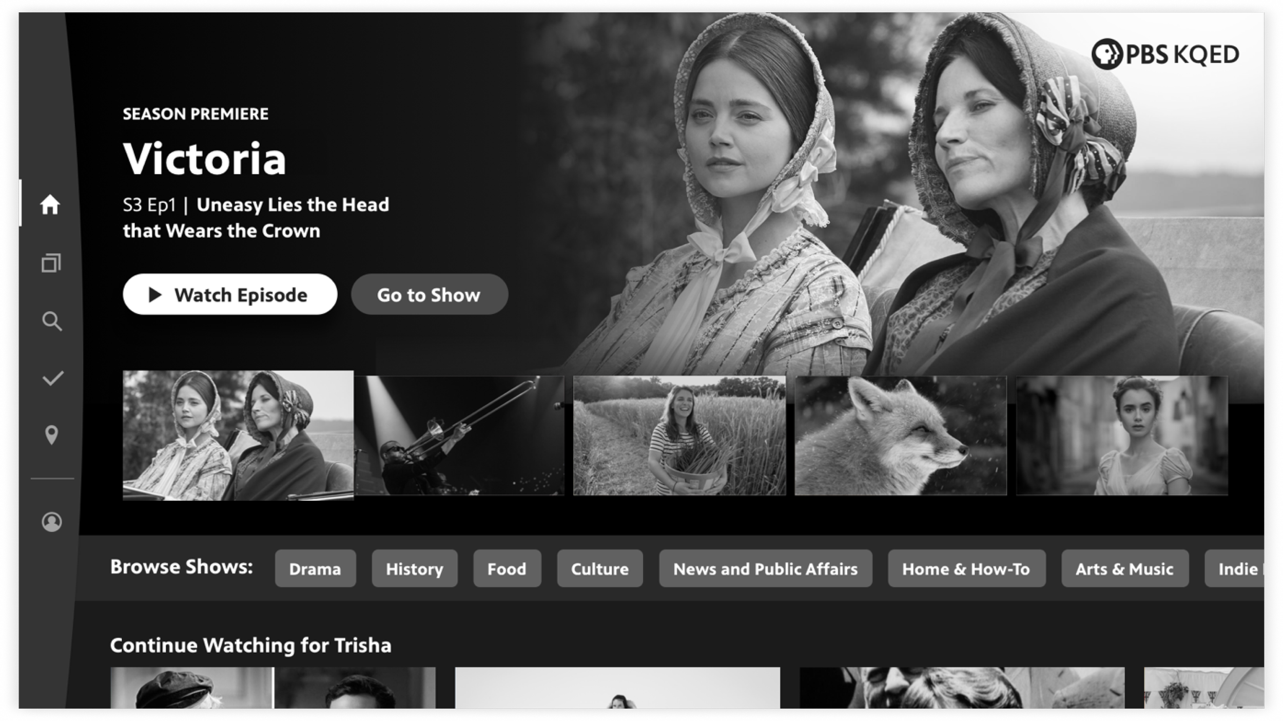
Home
4 featured videos lead content on the Home screen, with the 4th reserved for localized station content. Users can also jump back into an episode they were previously watching.
Home, scrolled
Users can browse through a set of curated show and video collections, or jump to a specific genre using Browse Shows buttons. Button spot 1 is reserved for Local, to boost discoverability of local station shows.
Show Detail
The new design focused on enabling users to jump into content as efficiently as possible. The previous app version required at least 1 extra click to get to a separate seasons screen, so we wanted to eliminate that and provide episode info and ability to add to My List upfront.
Other content like show description, clips, and similar shows was still accessible through a subnavigation — a reusable component leveraged on other screens.
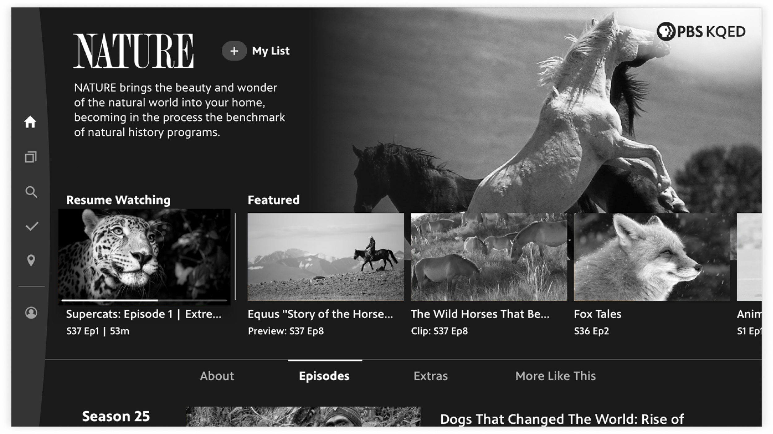
Shows
Users can swipe left-right to browse by genre, and within each genre can further sort by Popularity vs A-Z.
The local station shows are consistently in spot 2, to highlight station visibility; shows in Passport are in spot 3, to highlight back catalogs of shows users unlock by becoming members of their station. Other genres appear in A-Z order.
Video Detail
The Video screen focused the top area on the main details and creating a clear button hierarchy that elevated the 2 most important functions, to Play/Resume or Add to List.
Other content like more details, extras, and more episodes from the same show was still easily accessible through a subnavigation.
My Station
A new section in the navigation “My Station” serves as the home for content from your local PBS station.
A localized image and Donate CTA is contextualized with valuable content from their local station. User can watch local shows and learn more about their station’s Passport content they can access by becoming a donating member.
Search
Search is placed at the center of the bottom navigation, enabling users to easily get to it when needed. Episode information and the ability to add to My List are displayed upfront, so users can save videos to watch later without an extra click.
My List
My List was now always accessible from the consistent side nav, enabling users to more easily get back to the videos and shows that they’ve saved.
A peek into the process
EARLY Lo-FI EXPLORATIONSBrand proof-of-concepts
The ask was to design the ideal experience to become our north star of consistency for all TV platforms moving forward, and revamp the entire look-and-feel.
This project was simultaneous with establishing the visual system of the new PBS brand, so the question was: “how do we incorporate the brand’s signature visual elements, such as the circle crop and line-and-highlight, into an interactive UI?”
I quickly iterated on a range of ideas through lo-fi wireframes, with imagery and footage at the heart of the new brand in mind.
EARLY VISUAL DESIGN CONCEPTSPressure testing alongside the visual system + on-air motion
In partnership with our Creative Director and Digital Production Designer, we explored leveraging the circle crop element and circular forms to hold video info, in card patterns, and as a transitional element. We quickly realized as a team that the line-and-highlight was perfectly suited for a navigational element, especially when paired with motion and to move the user’s eye through content. In several options, I explored using the line either horizontally or vertically as the app’s main menu system, as well as for subnavigations for internal screens like an individual Show.
Because this exploratory work was key to informing the brand’s foundational visual system itself, as well as influencing the concurrent exploration of the on-air motion package, we had to iterate on full-color visual concepts early on, to quickly get feedback on what was and wasn’t working.
REFINEMENTS + USER TESTINGContent is the hero, and user insights that informed navigation
We eliminated concepts in which design elements were overtaking the content, as that fought against the new brand’s principles. We also ruled out options using a large circle crop; because content was constantly coming in and out of availability, Home relied on featuring individual video content, and that design pattern was better suited to feature show posters. For Shows, season patterns had to scale to include up to dozens of seasons for legacy shows.
User testing told us that the existing nav patterns on the legacy apps (tvOS, Roku) were frustrating for users, because they weren’t accessible on internal pages deep in the experience. With these learnings in mind, I focused on several iterations of sketches utilizing a consistent menu.
Hi-FI wireframes, MORE USER FEEDBACKImproving navigability and balancing business goals
The key pain point to resolve was making the navigation more intuitive. User feedback told us users were having a hard time finding their favorite shows and thought search should be more easily accessible.
This was balanced with high-priority goals to: 1) boost local station and content visibility, and 2) highlight the value of Passport, a subscription to unlock archival content by donating to your station.
-
![]()
Home
-
![]()
Home, Big Feature drop-in
-
![]()
Show Detail
-
![]()
Video Detail

USER RESPONSETestimonials from users
Responses during testing indicated a positive response to the redesign’s navigability, ease of discovering content, and validated alignment with the new PBS brand’s core principle of letting the content shine.