PBS
PBS Video Mobile App
BACKGROUNDWith the PBS Video app not seeing a major update in several years, we overhauled the experience to improve known user pain points while reflecting the newly refreshed brand. The new experience aimed to simplify wayfinding, increase video engagement, and highlight localized content unique to PBS.
OUTCOMESIn testing, 88% of wayfinding tasks were successfully completed and 100% rated ‘Very Easy’; 100% of wayfinding tasks to shows and videos from your local station were rated as ‘Very Easy’; and 87% rated the app as tying into the PBS brand extremely well. After the initial launch of MLP updates, we saw a 4% increase in screens per session for returning users and uptick in sessions per user (3.6 to 4.4).
The app was also well received internally, becoming a rallying point for strengthening station visibility and helping set the course for streamlining experiences across mobile, web, and TV.
ROLEAs Design Lead, I facilitated an end-to-end redesign of the app across mobile and tablet screens.
UX Design, Visual Design, Prototyping, User Testing
CREDITS
Chris Bishop, Laura King
Goals-
Simplify wayfinding throughout the app
-
Get core users more easily to the specific genres + content they want
-
Boost visibility and highlight the value of your local PBS station
-
Reflect the new brand's principles with a content-forward approach
Final screens
MOBILE-
![]()
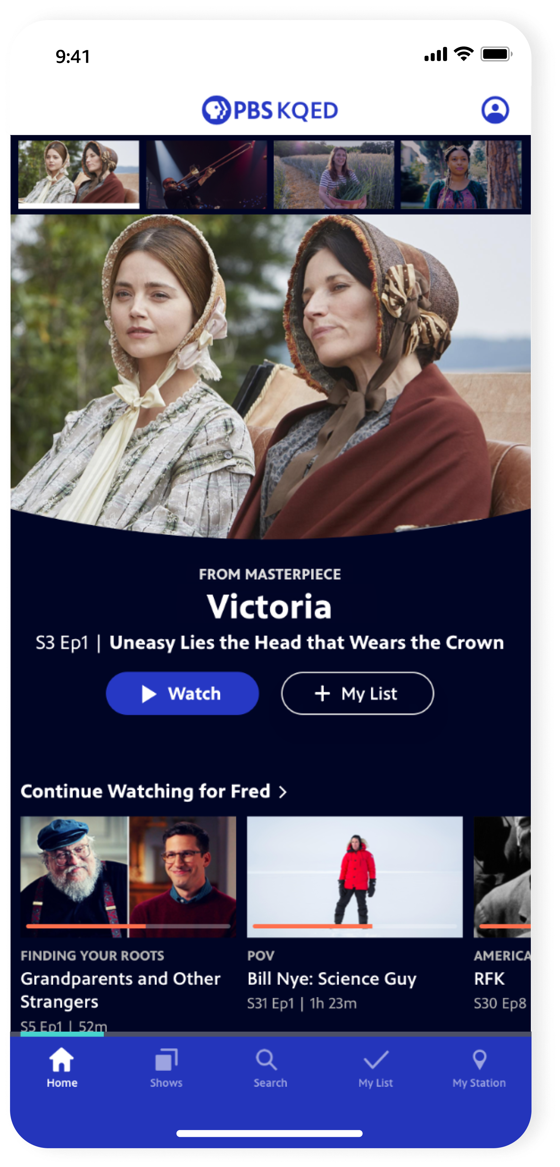
Home
-
![]()
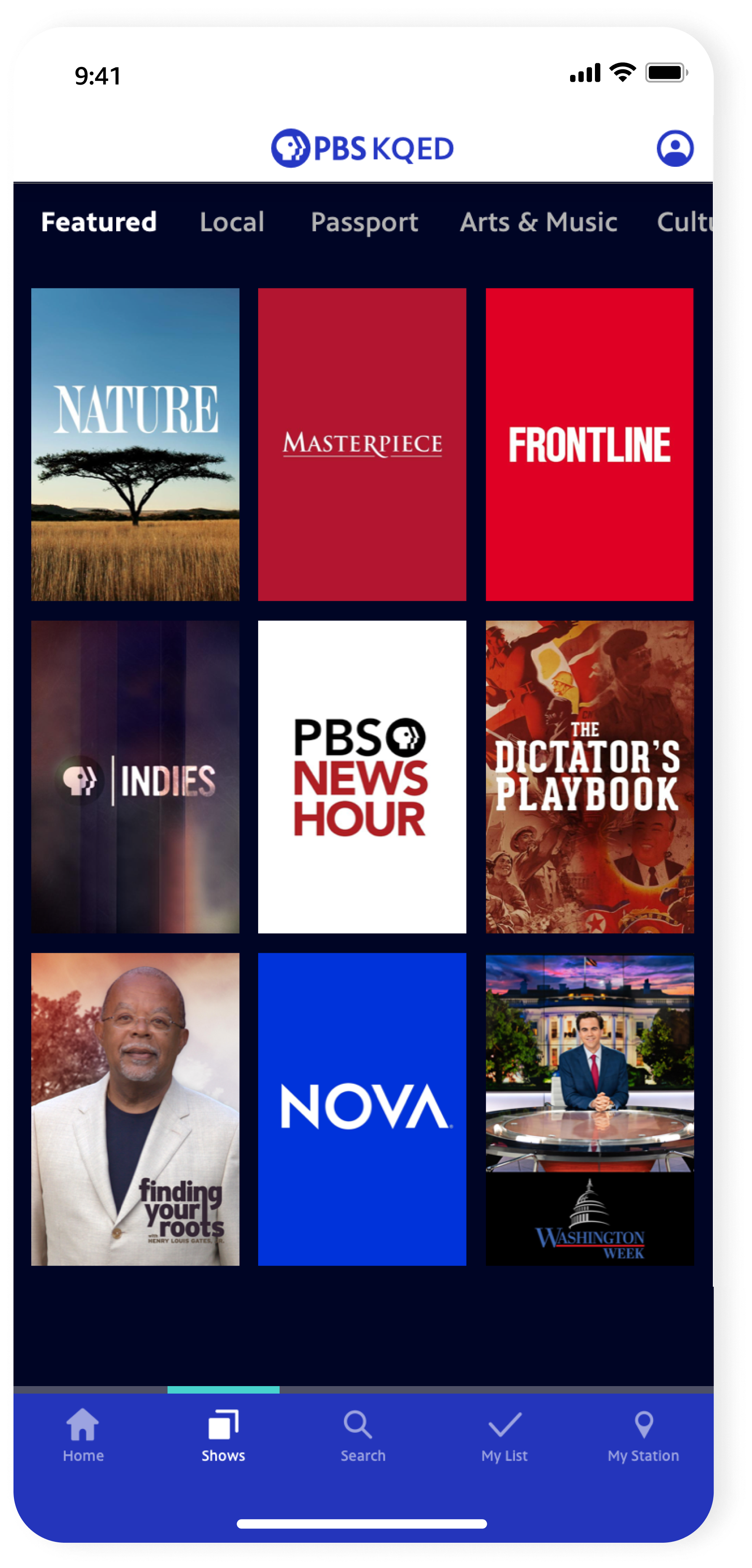
Shows
-
![]()
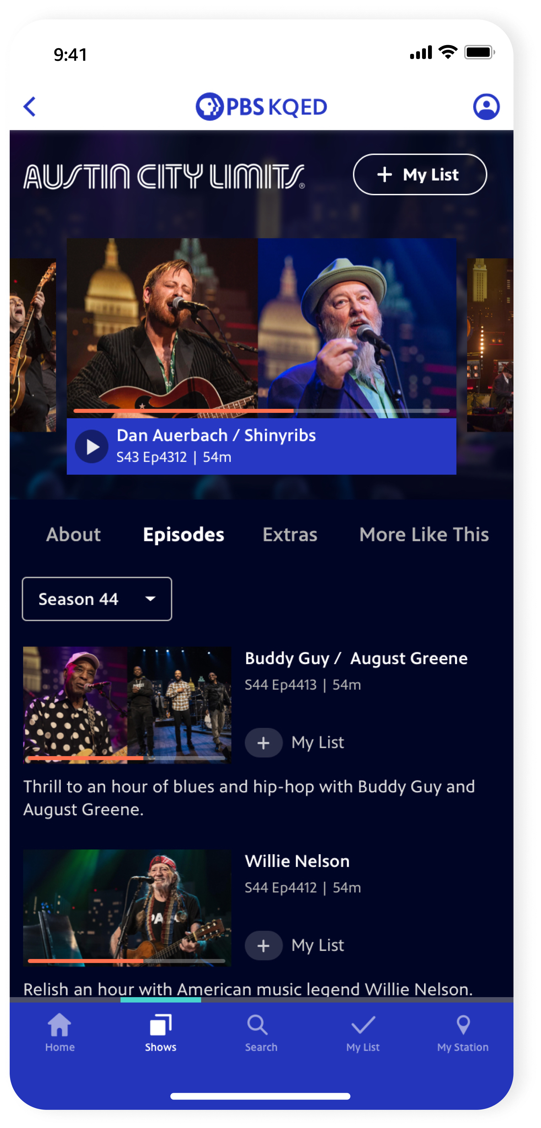
Show Detail
-
![]()
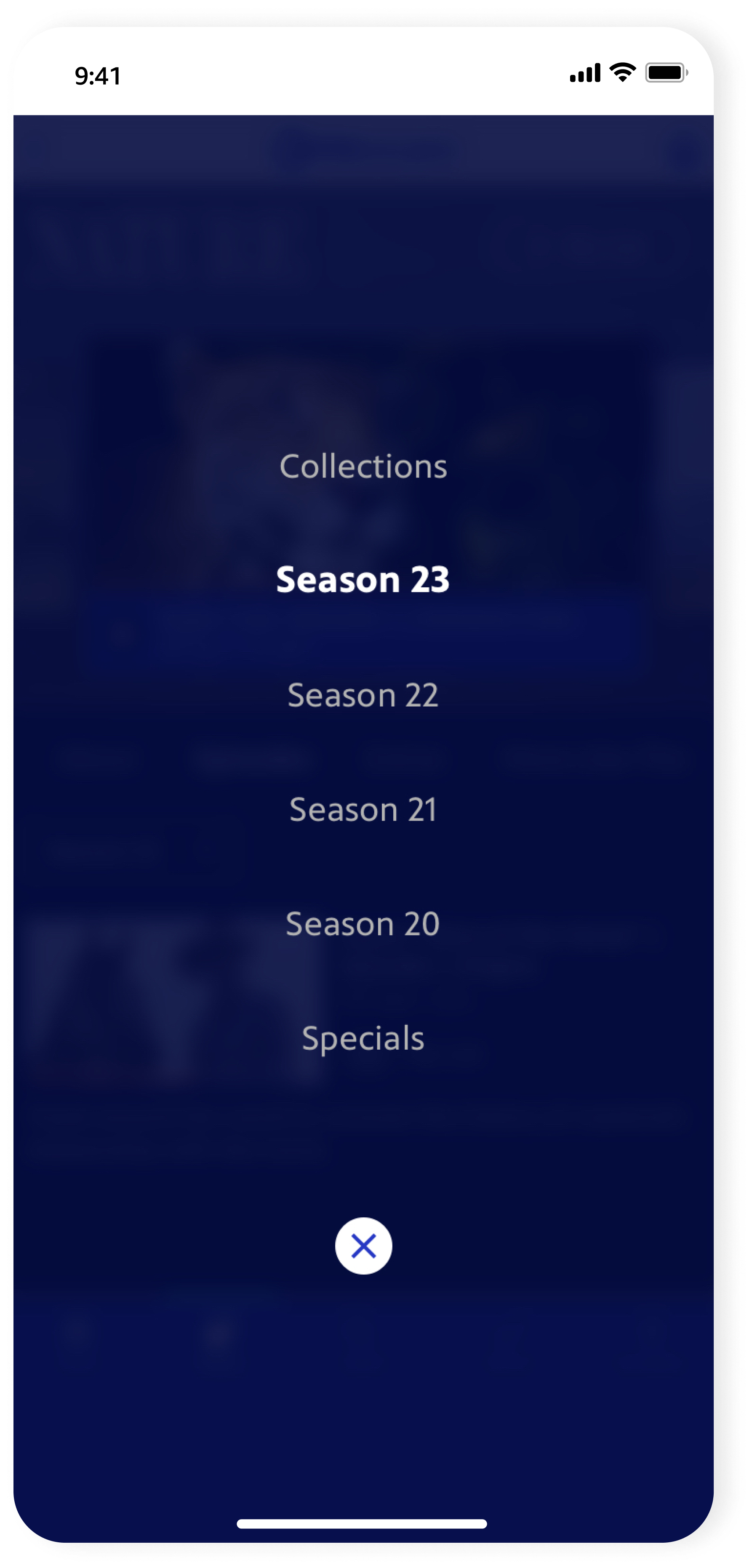
Season Picker
-
![]()
Video Detail
-
![]()
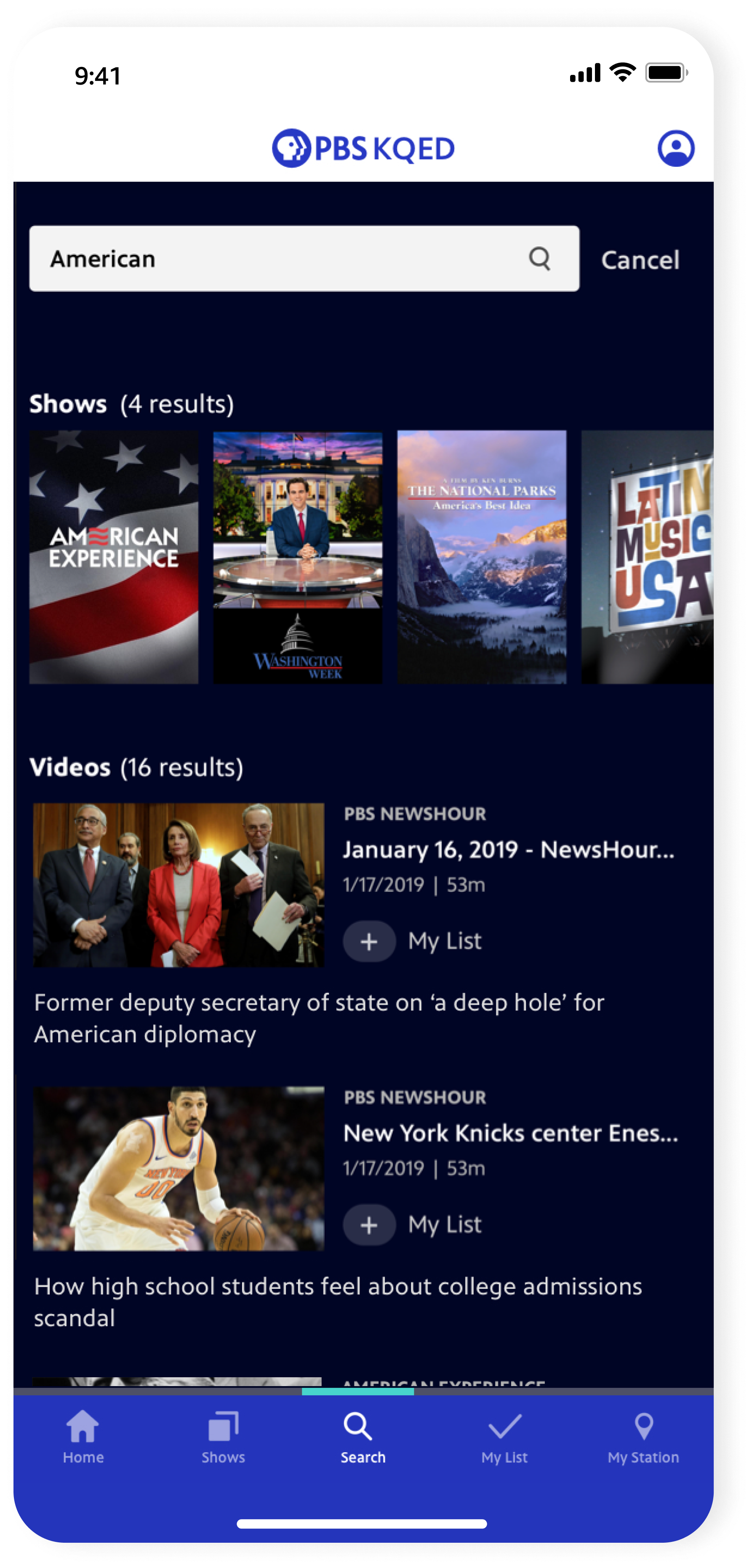
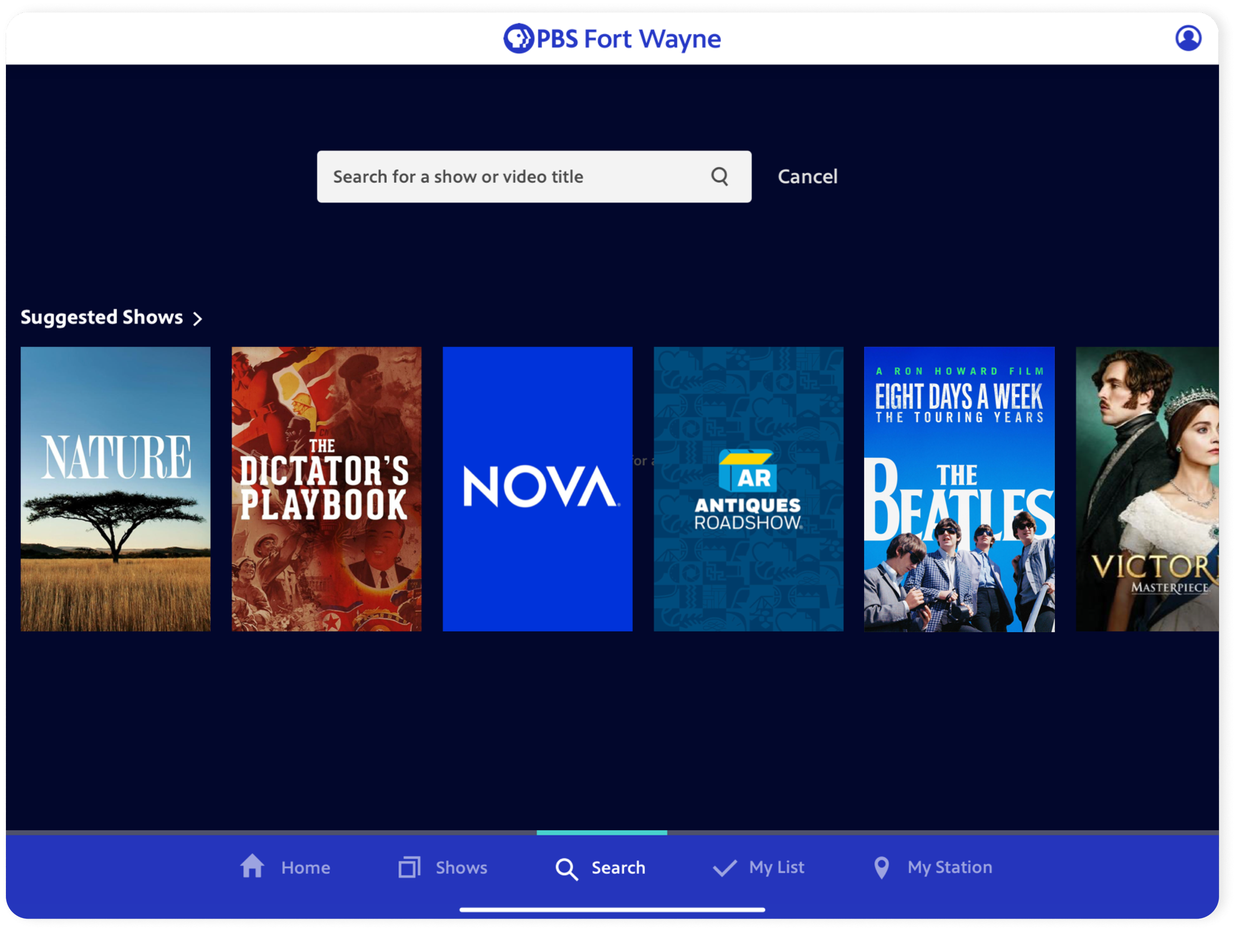
Search
-
![]()
My List
-
![]()
My Station
-
![]()
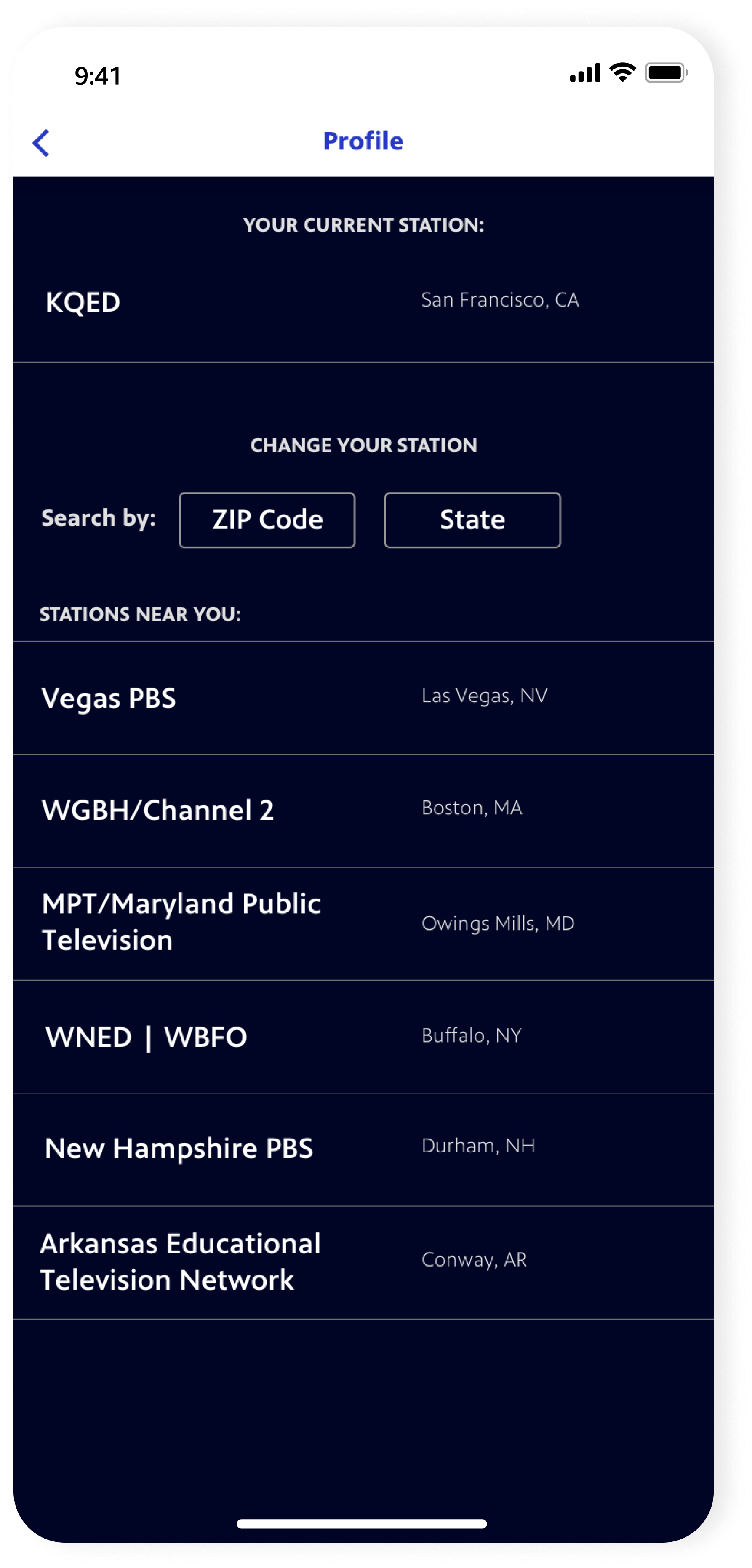
Profile
-
![]()
Change Station

Flows + highlights
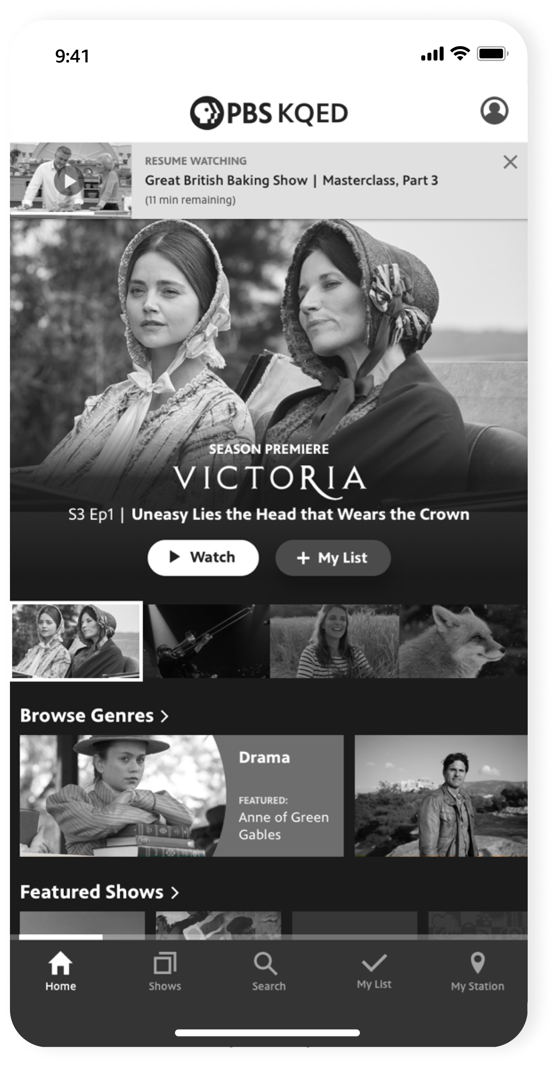
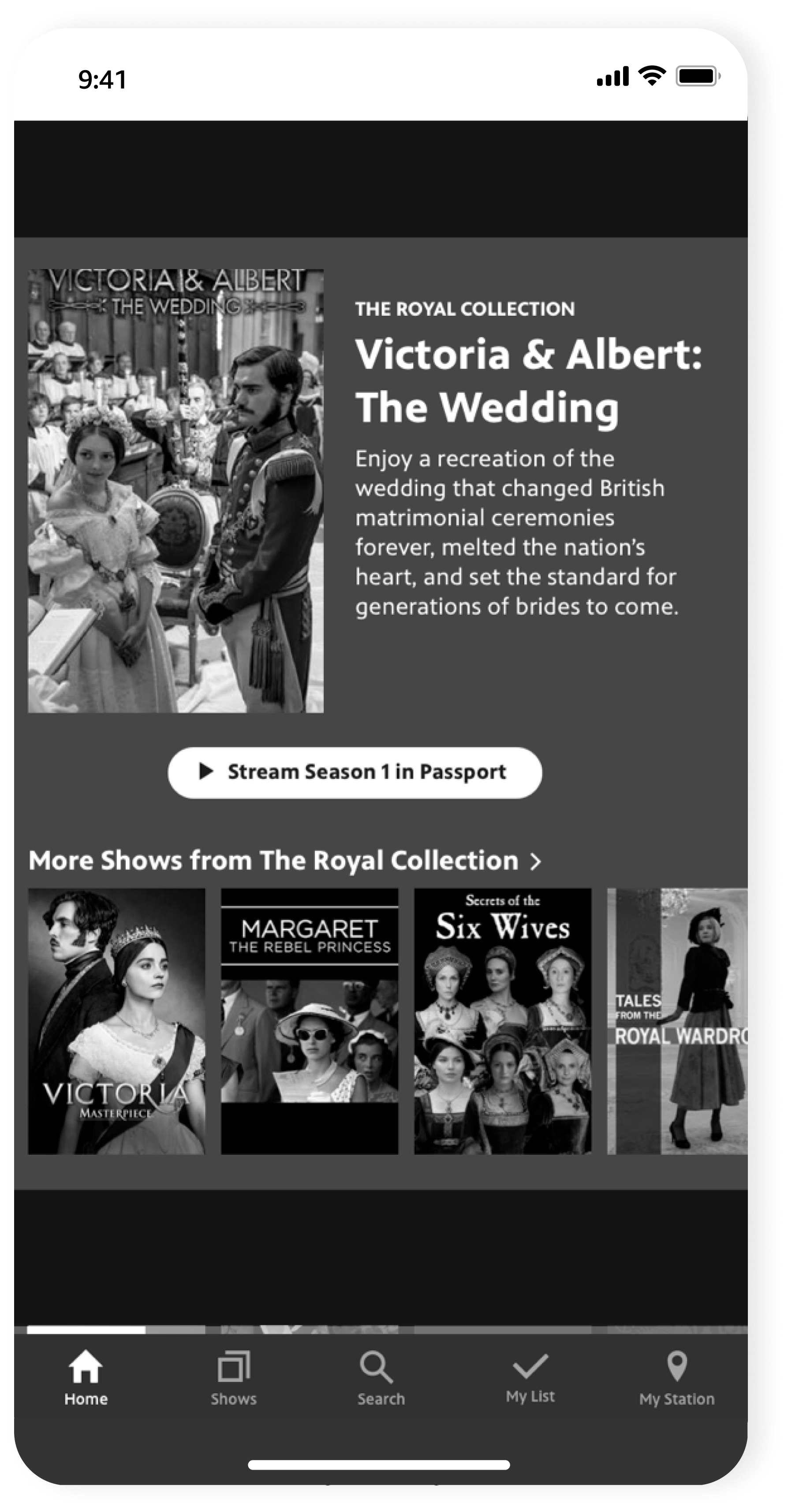
HOMECommunicating breadth and depth
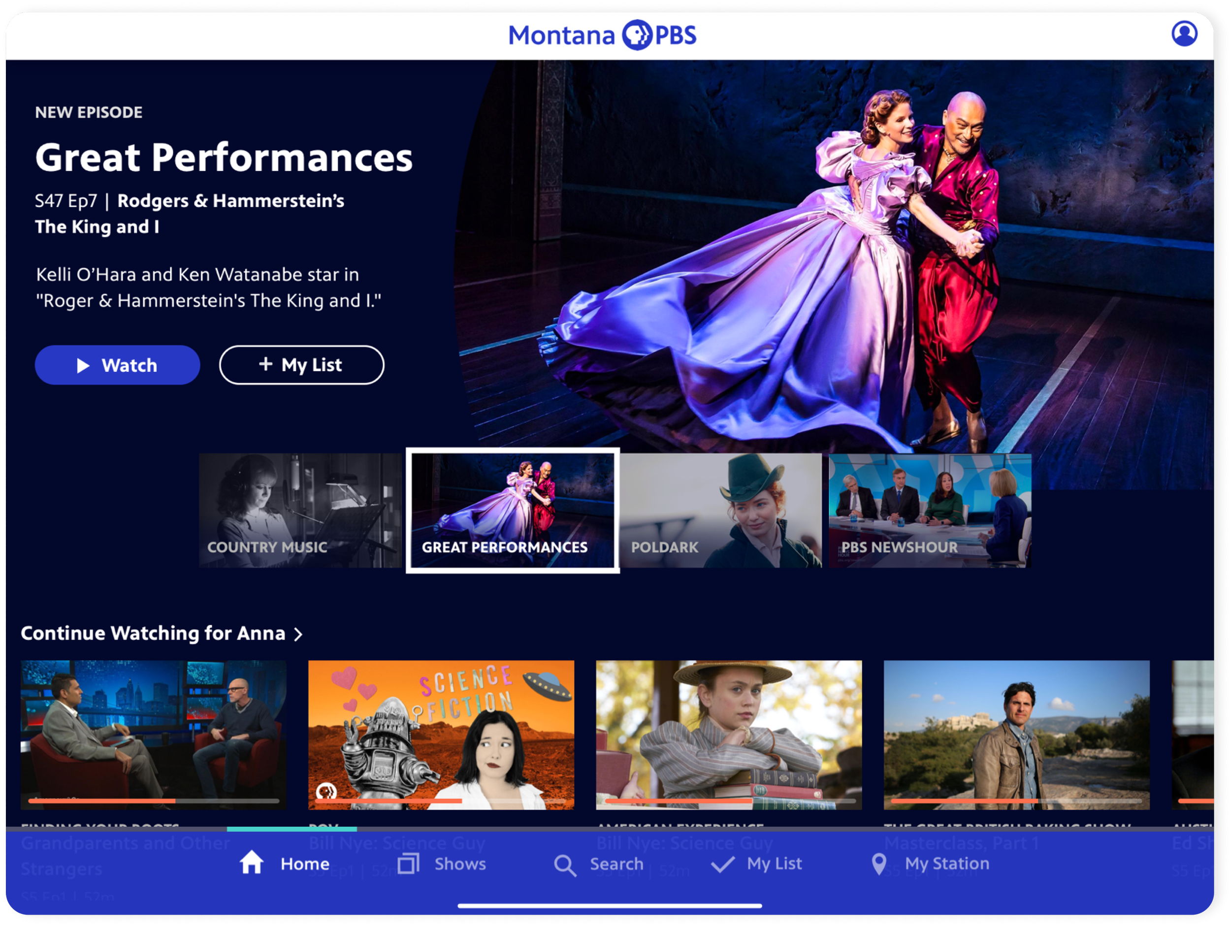
Home showcases the wide PBS content offering. For top features, slot 4 is reserved for content from your localized station. Users can jump back into recently watched episodes, or browse curated show and video collections. A special feature area promotes major quarterly campaigns.
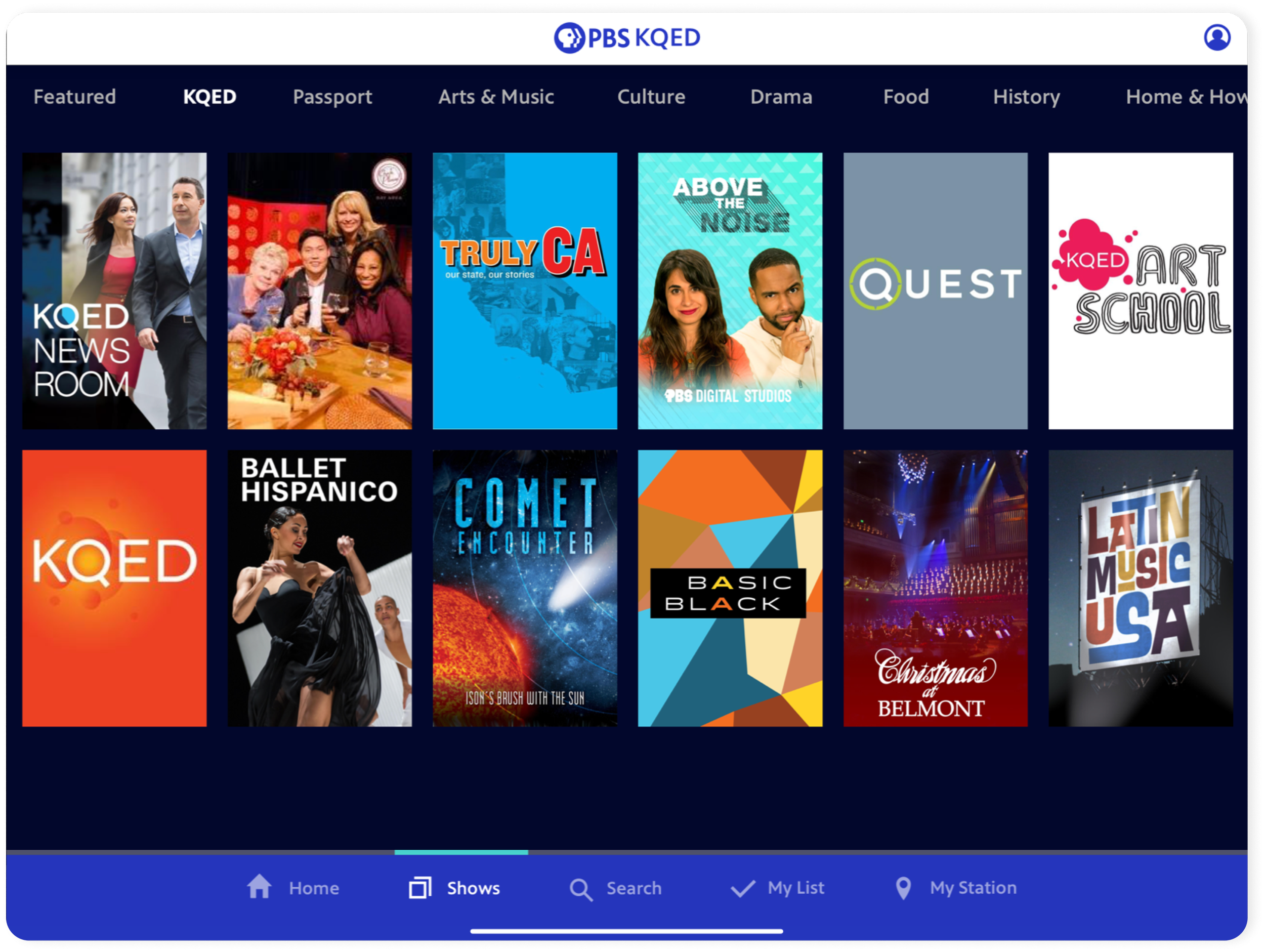
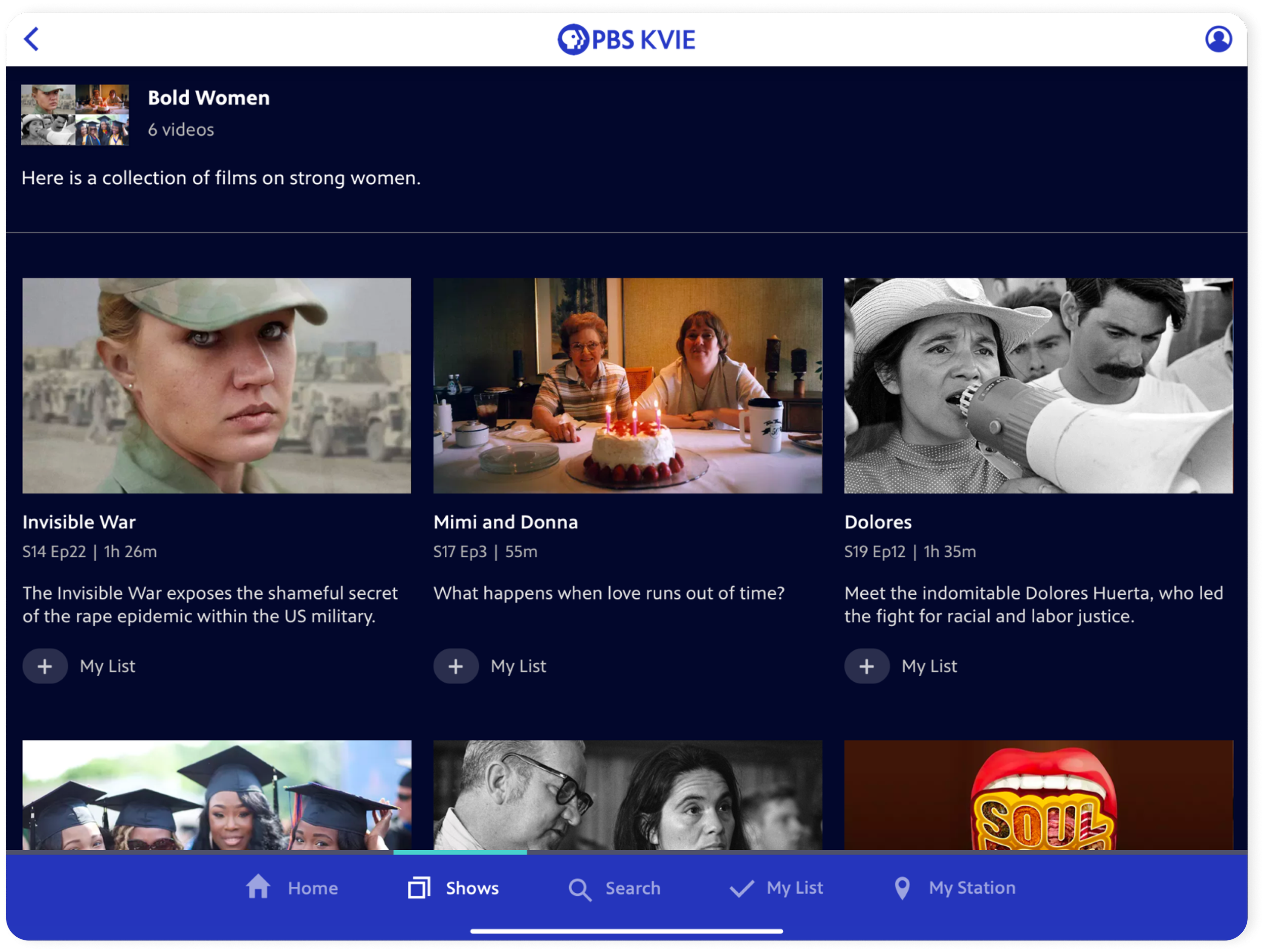
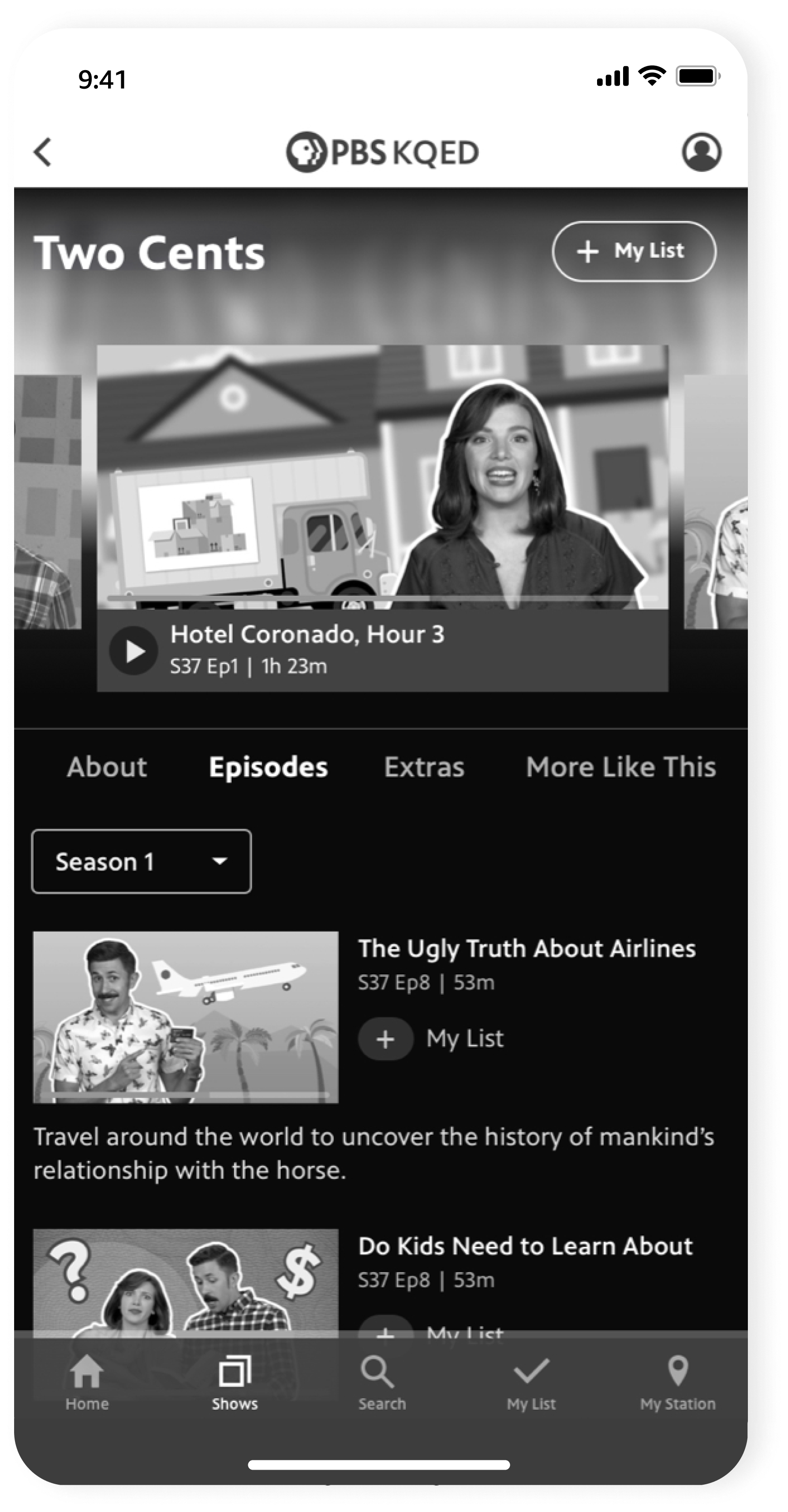
SHOWSElevating genre and Passport visibility
Users can browse by genre, with local station shows consistently in slot 2. Shows in the Passport subscription are in slot 3, highlighting back catalogs of shows that users can get access to by becoming donating members of their local PBS station.
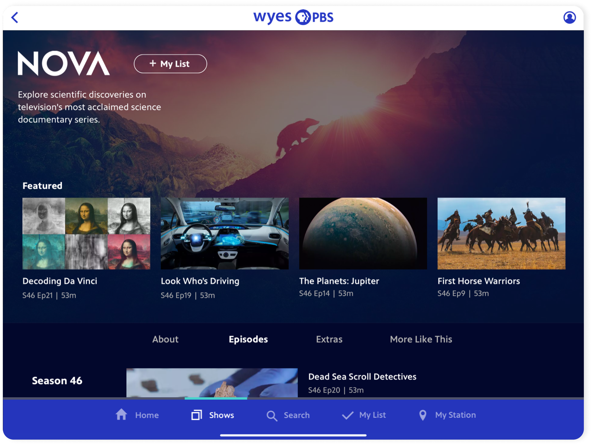
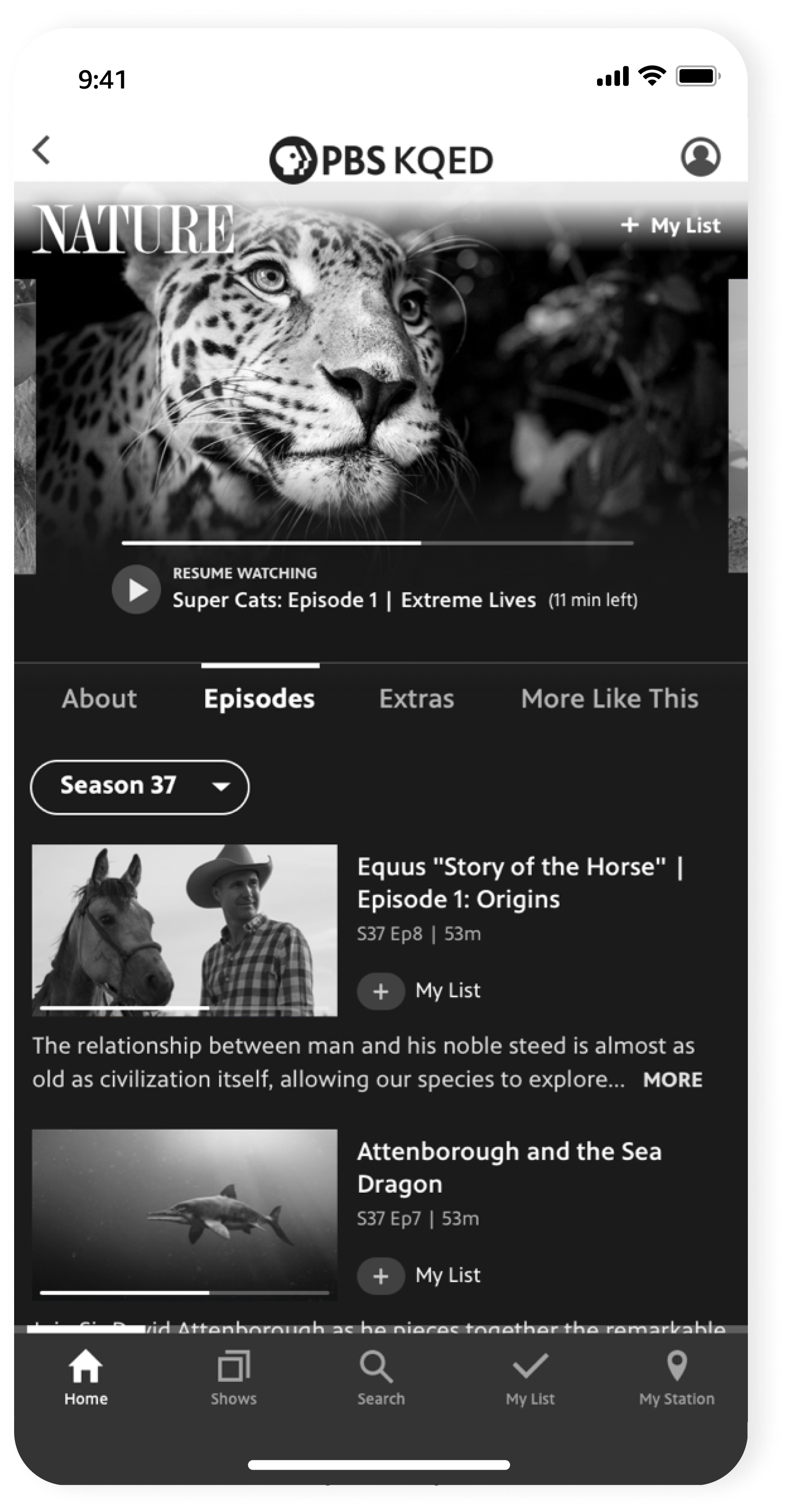
SHOW DETAILEpisodes front-and-center
The Show screen enables users to jump right into Episodes as quickly possible. Other content like show description, clips, and similar shows were tucked away but easily accessible via a sub-navigation.
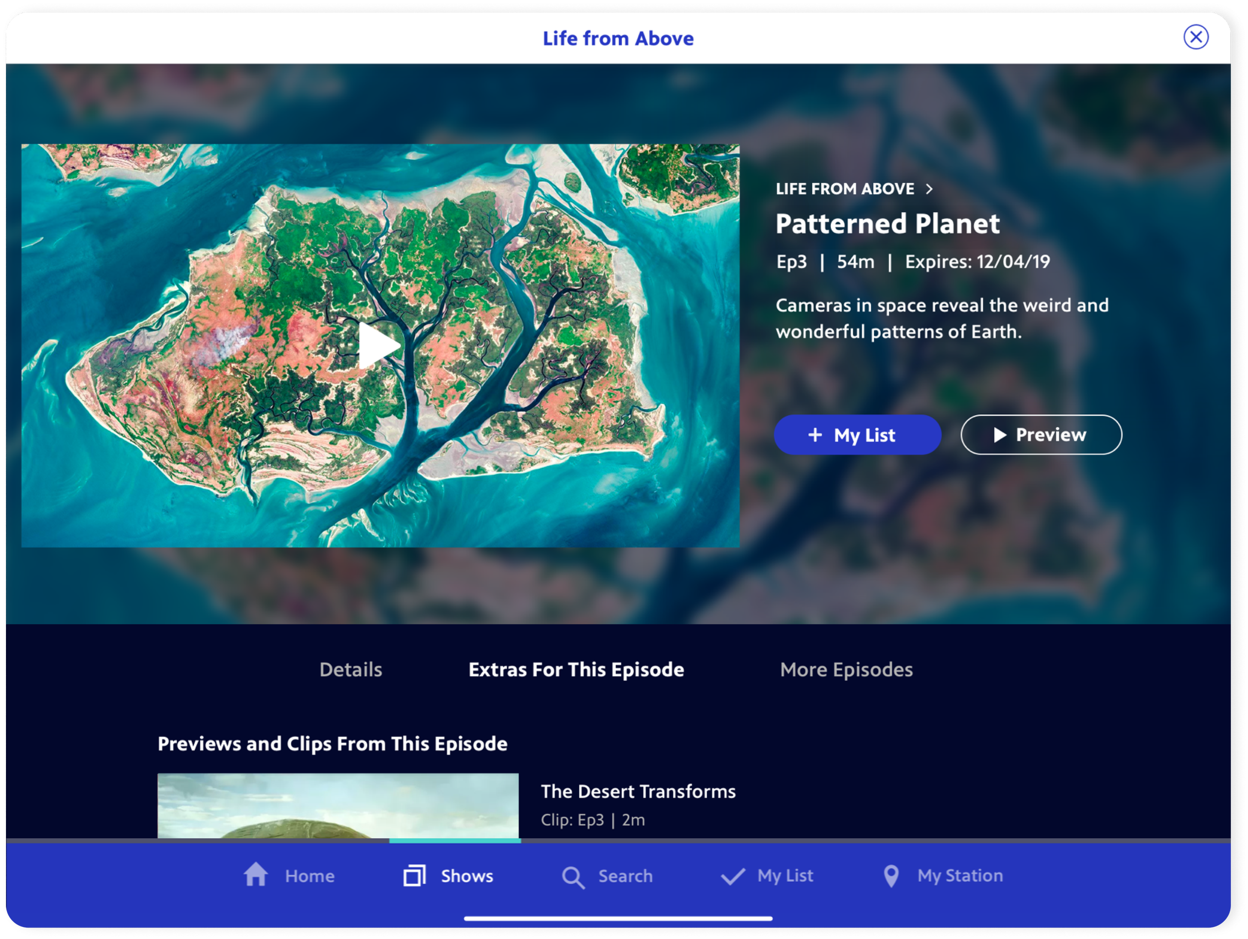
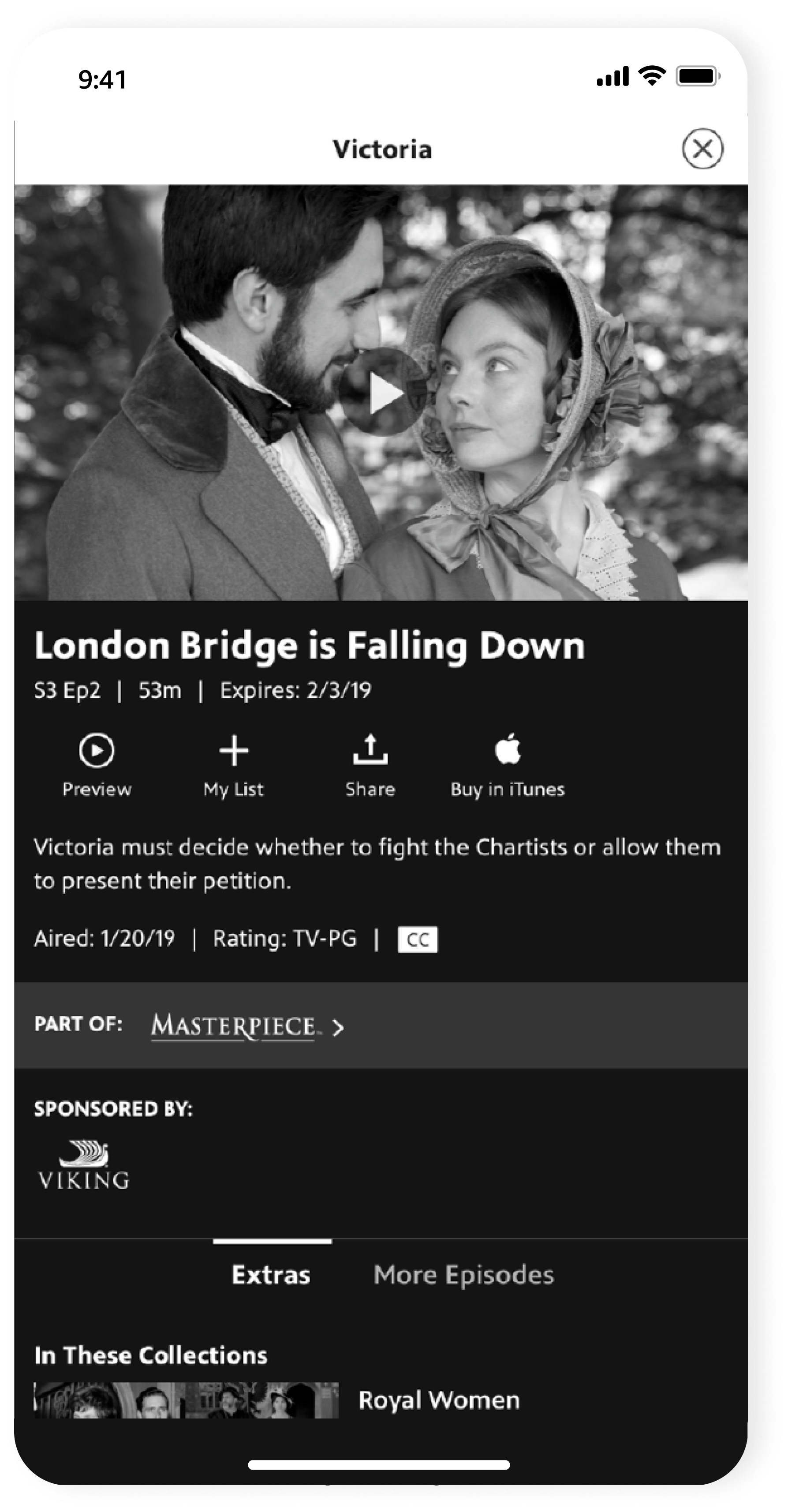
VIDEO DETAILQuick access to video, anywhere
Reducing friction and speeding up browsing was key. Video details are easily dismissable within a ‘disposable’ sheet. This was especially useful because Home curation relies on featuring individual videos, with PBS content constantly coming in and out of availability windows.
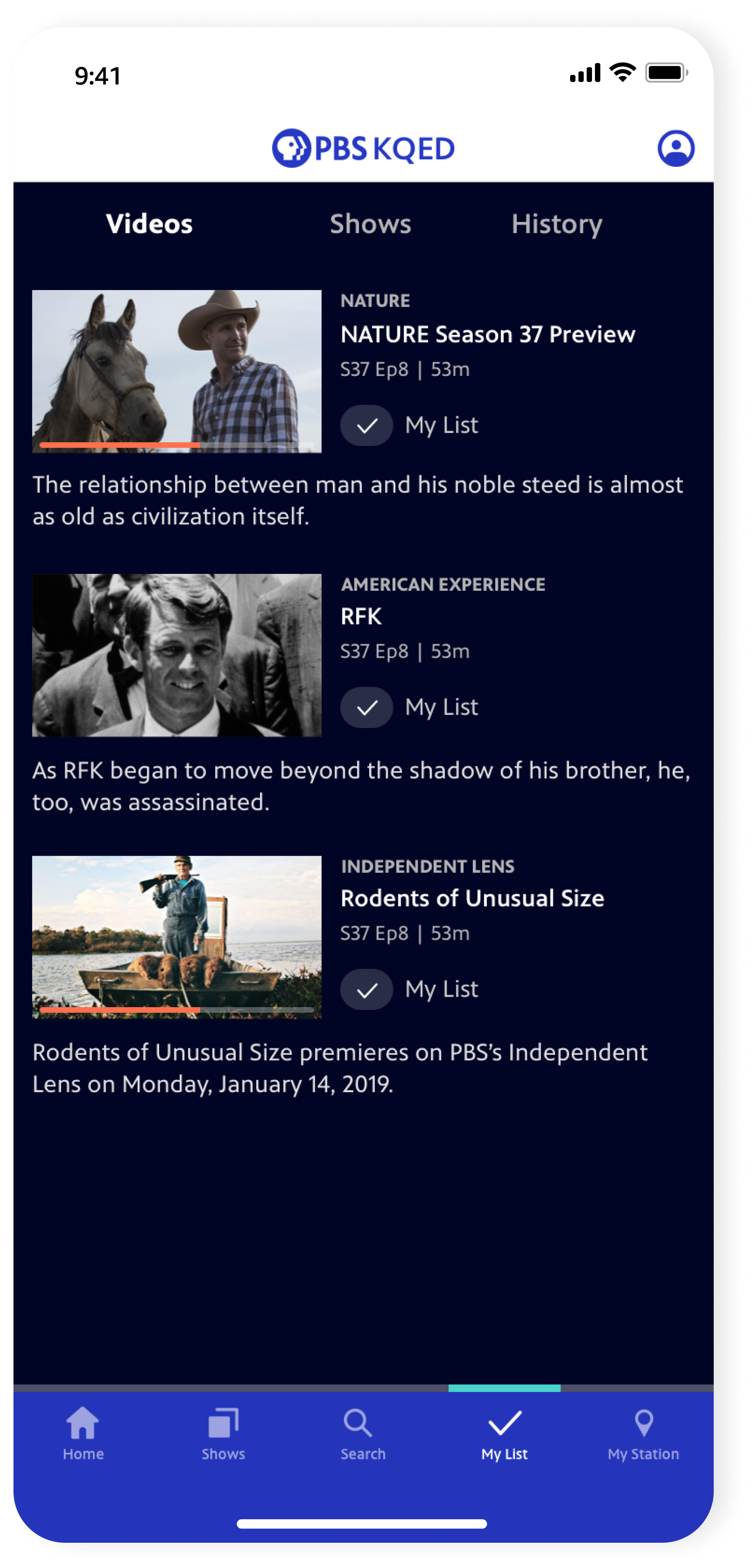
MY LISTUnifying + surfacing your saves
In the previous app structure, your Favorite Shows, Watchlist, and Viewing History were separate items n the leftside nav. My List is now always accessible within the bottom nav, and users can add to their List upfront across multiple screens.
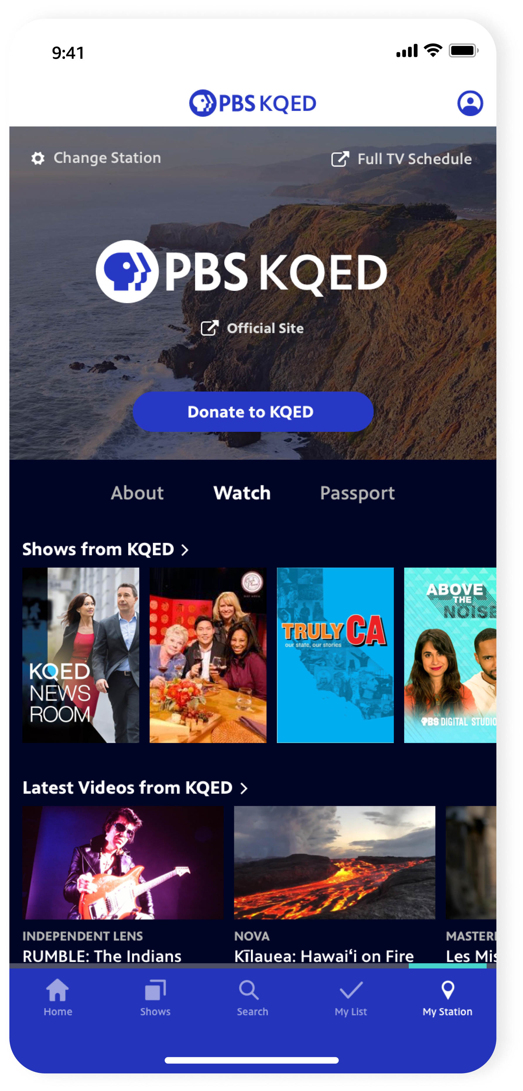
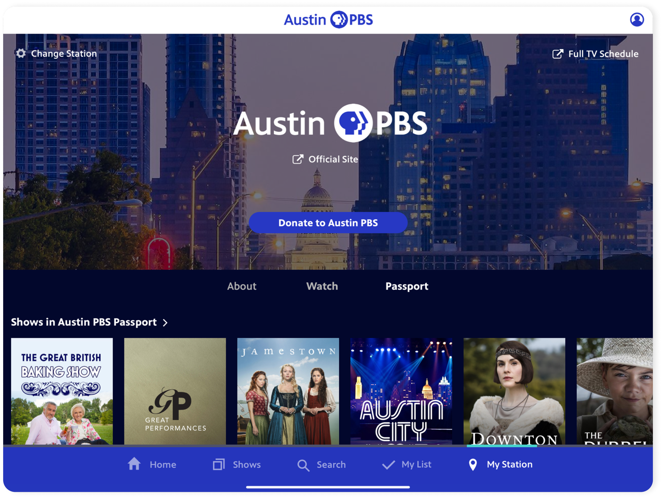
MY STATIONBoosting local station value
A new item in the navigation serves as the home for content from your local PBS station. This connects users to their community by contextualizing a Donate CTA with the breadth of local content and Passport offerings they can access by becoming a donating member.
TABLET-
![]()
Home
-
![]()
Home, scrolled
-
![]()
Shows
-
![]()
Show Detail
-
![]()
Collection
-
![]()
Video Detail
-
![]()
Search
-
![]()
My Station

A peek into the process
BEFOREThe previous app’s pain points

Besides Search, many users were using the Home screen as their only jumping-off point and were missing out on discovering more shows.

A lot of users weren’t opening up the side navigation.
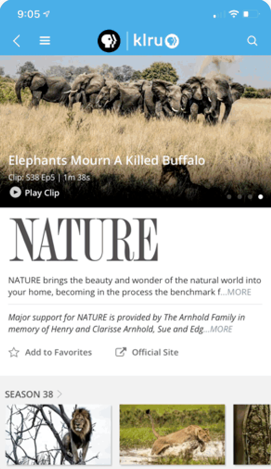
The Show screen was overloaded with too much info, and it took users too long to get to the Episode content they were looking for.
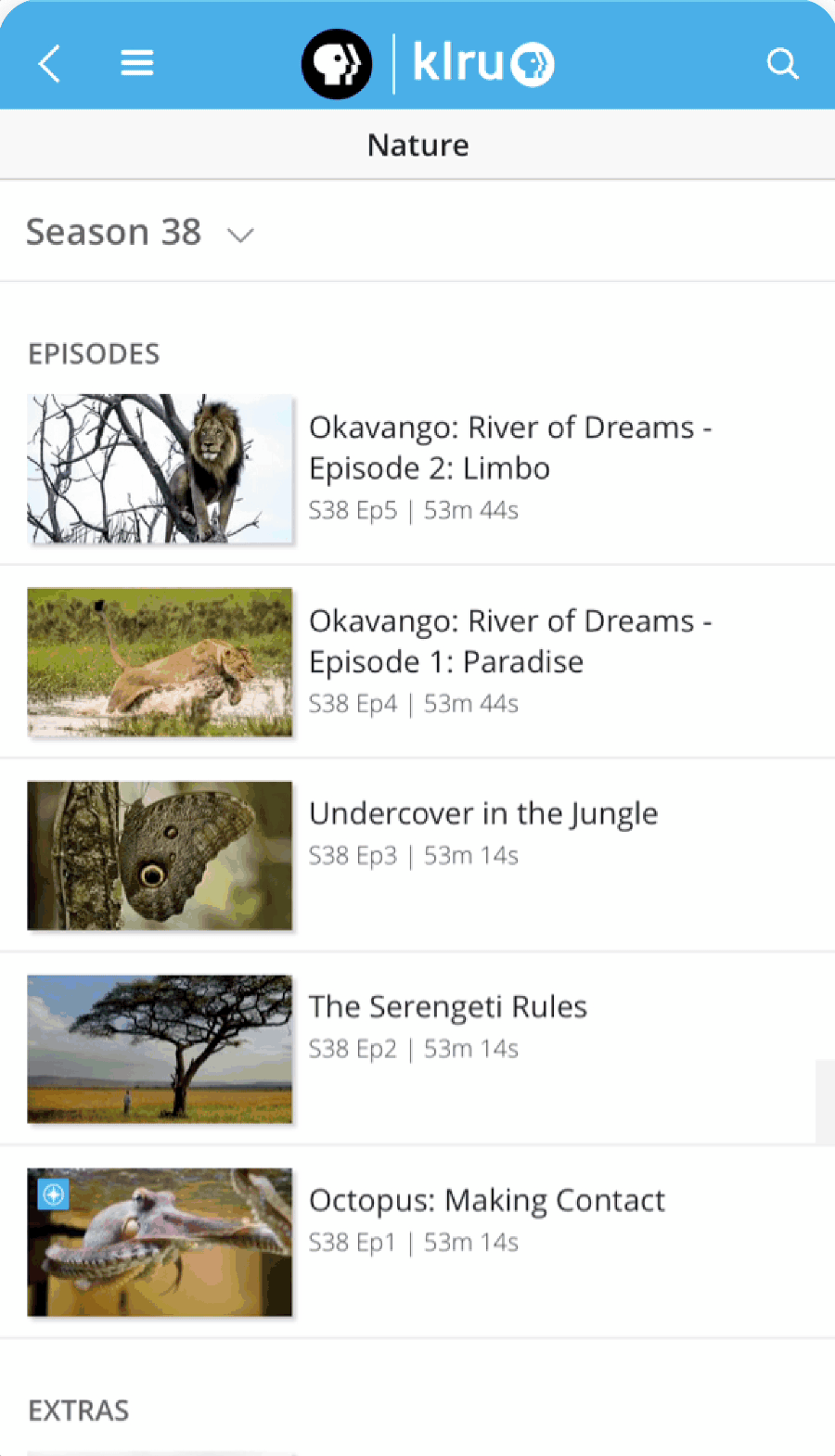
Overall, the UI was outdated and did not showcase the deep breadth of PBS content or local stations’ value.
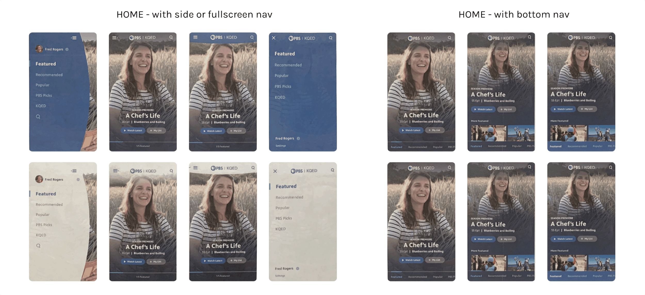
EARLY EXPLORATIONSBrand proof-of-concepts
The start of this project was tied to establishing the new design system for the PBS brand. I led high-concept, creative directions of how: 1) the new brand elements and 2) keeping show imagery at the heart could manifest via lo-fi wires of key screens.
Since this exploration was primarily focused on the visuals with loose requirements in mind, I moved these wires to quick-and-dirty visual design concepts. These served as early proof-of-concepts of pairing the new brand system and how we could feature content.

Defining personasAudience study
A segmentation study of 3,000 TV and video consumers age 18-74 in PBS’ addressable market helped inform this project. We identified 3 personas that had the highest mobile usage: the Global Citizen, the Drama Binger, and the Omnivore, and focused on their motivations and viewing goals.
Key takeaways: our core users 1) come to PBS for 1-2 specific genres, but have a hard time with content discovery; and 2) are highly motivated to donate.
SKETCHes + more sketches Rapid iteration, intentionally low fidelity
Focusing early rounds of stakeholder reviews on sketches kept us nimble with iterations.
Rd 1: A wide exploration around 4 key screens: Home, Show Detail, Video Detail, and Shows. Home needed to communicate the breadth and depth of our content offering, and overall I aimed to reduce taps to get to Episodes.
Rd 2: Scrapped limitations of side nav and focused on bottom nav to improve wayfinding. Elevated visibility of genres, and utilized a sub-nav on the Show screen to put Episodes at the forefront. This enabled other content to be tucked away, and established a reusable pattern for other screens.
Hi-FI wireframesKeeping content at the heart
Getting feedback on hi-fidelity wireframes was important in bringing our content-forward approach to life.
-
![]()
Home
-
![]()
Home, Big Feature drop-in
-
![]()
Shows, with sub-genre feature
-
![]()
Show Detail, v1
-
![]()
Show Detail, v2
-
![]()
Video Detail

USER TESTING Gaining valuable user insights
After visual design iterations of the wires to achieve the right hierarchy and balance, we user tested mobile and tablet prototypes of the new experience to inform updates to the final experience.
Prioritize ‘Resume Watching’ content on Home — Users preferred having a breadth of recently-watched content more easily accessible, over a mini single video banner.
Clarify Featured Videos interaction — The top Featured Videos pattern was initially confusing to users, and took a few iterations to ensure it matched up to expectations.
Validated better wayfinding — 100% of core wayfinding tasks were rated ‘Very Easy’, with several testers mentioning the app overall had easy navigation flows and filtering options to get to content.
USER RESPONSETestimonials validate the new brand’s principles
User responses during testing validated that the new app aligned to the new PBS brand’s core principles — Moving, Welcoming, and Bright.
Impact
In testing — 88% of wayfinding tasks successfully completed and 100% rated ‘Very Easy’; 100% of wayfinding tasks to shows and videos from your local station were rated as ‘Very Easy’; and 87% rated the app as tying into the PBS brand extremely well.
After the initial launch of MLP updates — we saw a 4% increase in screens per session for returning users and uptick in sessions per user (3.6 to 4.4).
Internally — The app was well received, becoming a rallying point for strengthening station visibility and helping set the course for streamlining experiences across mobile, web, and TV.